
Abstract
This note provides a gentle introduction to streaming data regression and prediction using Recurrent Neural Networks and Gaussian processes. We look at two examples. In the first we look at daily high temperature for two years at three different, but nearby NOAA weather stations. In the second example we look at daily confirmed infection of the Coronavirus in several US states. This study shows that if you have a predictable natural pattern that changes in predicable ways from season to season one can make reasonable predictions, but in the case of complex phenomenon such as the Covid19 pandemic, simple models do not always work well.
In a previous post we looked at anomaly detection in streaming data using sophisticated cloud based tools, but here we use simple “classic” ML tools that you can run on a laptop. We expect the seasoned data scientist will not get much out of this article, but if the reader is not familiar with recurrent networks or Gaussian processes this may be a reasonable introduction. At the very least, if you are interested in studying the Coronavirus infection data, we show you how to search it using Google’s BigQuery service.
Building a Very Simple LSTM Recurrent Neural Network
Recurrent Neural Networks were invented to capture the dynamic temporal behaviors in streams of data. They provided some early success in areas related natural language understanding, but in that area they have been superseded by Transformers, which we discussed in an earlier article. We will construct an extremely simple recurrent network and ask it to predict the temperature tomorrow given the temperature for the last few days.
We will train it on the average daily temperature over 2 years measured at three nearby weather stations in the Skagit valley in Washington state. The data comes from the Global Summary of the Day (GSOD) weather from the National Oceanographic and Atmospheric Administration (NOAA) for 9,000 weather stations. The three stations are Bellingham Intl, Padilla Bay Reserve and Skagit Regional. The data is available in Google’s BigQuery service named “bigquery-public-data.noaa_gsod.stations”. (We will show how to search BigQuery in the next section.)
Averaging the daily temperature for 6 years (2 years each for 3 stations) we get data like Figure 1 below.

Figure 1. Average daily high temperature for 2 years at 3 stations.
RNNs work by having a “memory” state tensor that encodes the sequence of inputs that have been seen so far. The input to the RNN is a word or signal, along with the state of the system based on words or signals seen so far; the output is a predicted value and a new state of the system, as shown in figure 2 below.
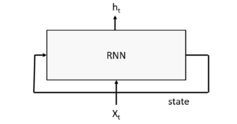
Figure 2. Basic Recurrent Neural network with input stream x and output stream h
Many variations of the basic RNN exist. One challenge for RNNs is ensuring that the state tensors retain enough long-term memory of the sequence so that patterns are remembered. Several approaches have been used for this purpose. One popular method is the Long-Short Term Memory (LSTM) version that is defined by the following equations, where the input sequence is x, the output is h and the state vector is the pair [c, h].

Where sigma is the sigmoid function and W is the leaned tensor. We are not going to use these equations explicitly because PyTorch has a built-in version that we will use. All we need to do is provide the dimension of the input (which is a sequence of scalar values, so that is 1) and the dimension of the state vector c_h is a tuple of tensors of size (arbitrarily chosen here to be) 100. We also have linear layer that will map the final value of h down to the one-dimensional output. Our simple LSTM neural network is

It is important to understand the role of the input x as a sequence. We want to train this network so that if we set x to be a sequence of consecutive daily high temperatures [t1, t2, … tn] then the forward method will return [tn+1]. To accomplish this training task we build a training set by scanning through the weather record andcreating tuples of sequences of length tw and the next-day temperature as a training label. This is accomplished with this function

From this we create a list of such tuples called train_inout_seq and the training loop takes the form

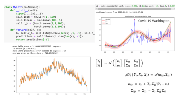
The complete details are in the notebook lstm-for-stream-final in the Github repository. This was trained on the average year and one the six yearly record. The results are shown below. The first two are the years that were training cases. The original data is printed in blue and the predicted data is printed in orange. As you can see virtually no blue shows. The network has memorized the training data almost perfectly with an average daily error that is less than 0.23 degrees Fahrenheit.


Figure 2. The results for the average of all the data (Figure 1 above) and for one of the individual stations. The LSTM network has memorized the training data.
In Figure 3 below we show the results when applied to two of the weather records for two of the other stations. In these cases, the results are not very impressive. In both cases the error average error was over 3.5 degrees and it was greater than 10 degrees for more than a dozen days. However, the predictions for one day ahead did track the general trends. It looks like it was able to predict todays temperature better than tomorrows.


Figure 3. Predicting tomorrows temperature on two other station records.
Doing Regression and Prediction with Gaussian Processes
Before we define Gaussian Processes let us point to Christopher Bishop’s amazing book “Pattern Recognition and Machine Learning” (Springer 2006) for a complete treatment of the subject. We will only provide a superficial introduction here. For on-line resources there is the excellent blog on the subject by Peter Roelants. We will use many of the code bits from that blog in what follows. Another fun on-line source for learning about Gaussian Processes is the blog A Visual Exploration of Gaussian Processes by Görtler, Kehlbeck and Deussen.
In the simplest terms, a Gaussian Process is a statistical distribution of functions with some special properties. In our case, the functions will represent the time evolution of stochastic processes. For example, the temperature at some location as a function of time, or the number of daily infections of a virus in a community, or the random walk of a particle suspended in a fluid.
The distribution that defines a Gaussian Process are characterized by a mean function u(x) and a covariance function k (x, x). A function f(x) drawn from this distribution, which is written
![]()
has the property that if when we pick a finite set of time points X = { x1 … xn } which we view as n random variable, the values y=f(X) are normally distributed in a multivariate Gaussian distribution with mean u(X) and a covariance matrix by a kernel function k(X, X). Written another way,

Given the covariance kernel function k() and mean function u() we can use this multivariant distribution to visualize what functions drawn from the Gaussian distribution look like. Let us pick 300 points on the interval [0,2] and a specific kernel (which we will describe later) and a mean function with constant value 1. The following numpy function will allow us to draw 10 sample functions

As shown in Figure 4 below they appear to be like random walks but they also appear to be not only continuous be also smooth curves. That is because nearby points on the x axis correspond to highly correlated random variables due to the choice of k(). If we had set Σ to be the identity matrix the variables at neighboring points would be independent random variables and the path would look like noise. (We will use that fact below.)

Figure 4. 10 different functions drawn from the Gaussian process.
Now for the interesting part. What if we have some prior knowledge of values of y for a sample of x points? We can then ask what is then the distribution of the functions?
View the n points on the time axis as n random variables. Partition them into two sets X1 and X2 where we are going to suppose we have values Y1 for the X1 variables. We can then ask for the posterior distribution p(Y2 | Y1 , X1 , X2 ). Reordering the variables so that X1 and X2 are contiguous the equation takes the form

where

One can prove that our condition probability distribution p(Y2 | Y1 , X1 , X2) is also a multivariate normal distribution described by the formulas

The proof of this is non-trivial. See this post for details. The good news here is we can calculate this if we know the prior kernel function k() and mean m(). Picking these function is a bit of an art. The usual way to do this is to pick k() so that m(x) = 0 so that u2 and u1 in the above are 0. Picking the kernel is often done by forming it as a linear combination of well-known standard kernel function and then formulating a hyper-parameter optimization problem to select the best combination.
To illustrate this, we can return to the weather station data. We have two years of data from three nearby stations. We note two properties of the data we must exploit: it is noisy and approximately periodic with a period of 365 days. We will not bother with the optimization and rather take a straightforward linear combination of three standard kernels.

The first of these is the exponential quadratic and it is a very good, default kernel. The second is the white noise kernel where the parameter sigma gives us the standard distribution of the noise we see in the data and the third is the periodic kernel which if we map our 365 days onto to the unit interval we can set p = 1. Our kernel of choice (chosen without optimization, but because it seems to work o.k.) is
![]()
Where for the first two terms we have set sigma to one and we pick the sigma for the noise term to best fit the data at hand. The figure below illustrates the result of using the average of the six instrument years as the raw (prior) data. Then we select 46 points in the first 230 days (spaced 5 days apart) as our X1 days.
In the figure the red dots are the points and the red line is u2|1 conditional mean function. Three additional lines (blue, green and yellow) are sample function drawn from the posterior. The pink zone is two sigma of standard deviation in the prediction. We also calculated the error in terms of average difference between the mean prediction and the raw data. For this example, that average error was 3.17 degrees Fahrenheit. The mean function does a reasonable job of predicting the last 130 days of the year.

Figure 5. Graph of the raw data, the mean conditional u2|1 (red line), and three additional functions (blue, yellow and green) drawn from the posterior.
The full details of the computation are in the jupyter notebook “Gaussian-processes-temps-periodic”, but the critical function is the one that computes p(Y2 | Y1 , X1 , X2) and it is shown below (it is taken from Roelants blog)

In this case we invoked it with kernel_function as keq + kp. Sigma_noise was 0.3. The clever part of this code was the use of a standard linear algebra solver to solve for Z in this equation

But because Sigma11 is symmetric and the transpose of Sigma12 is Sigma21 we have
![]()
Once you have that the rest of the computation is accomplished with the matrix multiply (@) operator.
In the notebook Gaussian-process-temps-periodic in the Github repository you can see the Gaussian processes for the six year samples.
The Coronavirus Data
Another interesting source of data comes from the daily confirmed cases of coronavirus infections in various states. We shall see that the troubling recent growth rate is so large that it is very hard for our Gaussian process models to make predictions based on recent past samples. However, we thought it may be of value to illustrate how to obtain this data and work with it.
The Covid-19 data is in the Google cloud uploaded from the New York times. To access this you must have a google cloud account which is free for simple first-time use. We will run google’s bigquery to extract the data and we will run it through a client in a Jupyter notebook. You will need to install the bigquery libraries. A good set of instructions are here. To use Jupyter go here . You will need to add the json package containing you service account key to your environment variables and described here. Finally install the local libraries with this command on your machine.
pip install –upgrade google-cloud-bigquery[pandas]
First load the bigquery library and create the client in a Jupyter notebook with the following

There are a number of covid19 data sets available on BigQuery. The one we will use is the New York Times collection. The following query will request the data for the state of Washington, load it into a Pandas dataframe and print it.


In our notebook bigquery-Covid we have the code that will extract the number of cases per day so that we can fit the Gaussian process to that. That data is stored in the array ar_wash. We attempted to make predictions with a sample every 9 days until the last 10 day. Because of the large range of the data we scale it down by a factor of 1000. The result is shown below. The function make_gaussian is the same one we used for the weather station data except that the kernel is only the exponential quadratic.

As can be seen the mean function (red line) capture features of the last 10 days reasonably well. Looking at New York we see similar results, but the fit for the last few days is not as good.

Where we fail most spectacularly is for those states that experienced a wave of new cases on the first week of July. Here is Florida.

Changing the prediction window to the last 3 days does a bit better. But 3 days is not much of a prediction window.

However, it is clear that a much more complex process is going on in Florida than is captured by this simple Gaussian process model. The approach presented here is not a proper infectious disease model such as those from Johns Hopkins and IHME and other universities. Those models are far more sophisticated and take into account many factors including social and human behavior and living conditions as well as intervention strategies.
Conclusion
As was pointed out in the introduction, this is a very superficial look at the problem of predicting the behavior of streaming data. We looked at two approaches; one that focuses on accurate prediction of the next event using neural networks and one that attempts to capture long range statistical behavior using Gaussian process models. The neural net model was able to learn the temperature patterns in the training data very well, but for test data it was much less accurate with average error of about 3- or 4-degrees Fahrenheit per day. (This is about as good as my local weather person). On the other hand, the Gaussian process made very good long range (over 100 days) predictions with only a small number of sample points. This was possible because the Gaussian process model works well for patterns that have reasonably predictable cycles such as the weather. However, the Gaussian process failed to capture changes in the more complex scenario of a viral infection where the dynamics changes because of social and human behavior or by evolutionary means.
If the reader is interested in extracting the data from Google’s BigQuery, we have included the detail here and in the notebooks in the repository https://github.com/dbgannon/predicting_streams.
