Author Archives: dbgannon

Unknown's avatar

About dbgannon

Dennis Gannon is a computer scientist involved with the application of cloud supercomputing to data analysis for science. From 2008 until he retired in 2014 he was with Microsoft Research as the Director of Cloud Research Strategy. In this role he helped provide access to Azure cloud computing resources to over 300 projects in the research and education community. Gannon is professor emeritus of Computer Science at Indiana University and the former science director for the Indiana Pervasive Technology Labs. His research interests include cloud computing, large-scale cyberinfrastructure, programming systems and tools, distributed computing, parallel programming, data analytics and machine learning, computational science, problem solving environments and performance analysis of scalable computer systems. His publications include more than 100 refereed articles and three co-edited books. Gannon received his PhD in computer science from the University of Illinois Urbana-Champaign and a PhD in mathematics from the University of California, Davis.

Data and Code Available for Science Doc ML and microservice experiment

The data and code used in the azure python streaming data experiments that were described in the blog on microservice performance architecture and Processing Scholarly Event Streams in the Cloud. The code has been rewritten to be free of all azure dependencies with the exception of the use of Azure Tables for the final storage from the table web service. It is certainly possible to rewrite this to use another database.

There are four type of data

  1. The arxiv configuration files. They take the form of config_name.json where name can be all4 (the top level), bio (the arxiv q-bio objects), compsci (computer science), math, phy (Physics), finance (finance).
  2. The machine learning model files (as generated by doc_analysis_final.py described below)
  3. The raw daa from the streams. There are three of these. The sciml_data_arxiv is the original data set from arxiv. sciml_data_arxiv_new_9_28_15 is a recent snapshot of arxiv data not used in the training a portion of this was used for the training set. The sciml_data_scimags is the rss data from the various science mags.
  4. The output of the main (top level) classifer. This was used to push events directly to the message broker for use in the performance analysis. This takes the form dump_all_subtopic_name where name is one of q-bio, Physics, compsci, math or physics. (note these are not the same as the names on the config files.)

The data is stored in two places.

  1. The configuration data, the rss feed input data and model data is stored on a publicly readable oneDrive site. The url for this is http://1drv.ms/1PCOT8l (cut this link and paste it into your browser.)
  2. The oneDrive files are ok for download from the browser, but not as efficient for program level access. So the programs here read the files from an public, read-only account “http://esciencegroup.blob.core.windows.net/scimlpublic” The code for reading the files is included in the source codes.

The code is now on gitHub at https://github.com/dbgannon/sciml

it is not the prettiest code.   wouldn’t pass a code review at MS, but i am moving on to something else now.

Performance Analysis of a Cloud Microservice-based ML Classifier

(This is an edited version correcting some of the analysis in the version i posted last week)

Microservice architectures have become an important tool for large scale cloud application deployment. I wanted to understand how well a swarm of microservices could be used to process streams of events where a non-trivial computation is required for each.   I decided a fun test would be to use machine learning to classify scientific document abstract that appear on public RSS feeds.   This is the first result of that experiment.  It uses a very small Mesosphere cluster on Microsoft Azure.   I will release the code to GitHub and data as soon as i clean it up a bit.

In a previous post we looked at building a document classifier for scientific paper abstracts.   In this post we will see how we can deploy it as a network of containerized microservices running on Mesosphere on Microsoft Azure.  We will then push this network of services hard to see how well it scales and we will try to isolate the performance issues. Specifically we are interested in the following challenge. If you have a heavy stream of events coming into a stream analysis system you may overload your services.   The conventional wisdom is that you can scale up the number of servers and services to cope with the load.   Fortunately more than one microservice instance can be deployed on a single VM. But does increasing the number of services instances per VM allow us to scale the system to meet the throughput requirements? Are there fundamental limits to how well this strategy will work? What are the limiting factors?

To summarize where we are so far, we have a set of RSS feeds that are “pushing” scientific publication events to us.   Our system looks at the abstracts of these events and use several different machine learning tools to classify the document into one (or more) scientific disciplines and sub-disciplines.   We have five major disciplines: Physics, Math, Biology, Computer Science and Finance. Each of these major disciplines is further divided into a number of sub-disciplines or specialties. We have divided the work into four main activities

  1. Training the classifiers. For this we used some of the labeled data from the ArXiv RSS feeds as training data.   (This was discussed in detail in the previous post, so we won’t go over it again here.)   This training phase is used to generate models that will be used by the classifier services discussed here.   We generate models for the main topic classifier and each of the sub-domain classifiers.   This is a pre-processing step and it is not counted in our performance analysis.
  2. Pulling the events from the RSS feeds and pushing them to the main topic classifier. The main topic predictor/classifier uses two primary machine learning methods to determine which disciplines the incoming documents belongs to.   As we have seen, these two methods agree on the discipline about 87% of the time. But sometimes they disagree on a document and we have two potential correct answers.   We interpret this as a potentially “interdisciplinary” research document and classify it as belong to both answers.
  3. Doing the sub-domain classification. As shown in the Figure 1 below the major topic classifiers push the document to the one (or two) sub-discipline specific classifiers.   These classifiers use the same ML methods as the main topic classifier to further classify the document into the sub-disciplines.

architecture

Figure 1.   Conceptual model of the document classifier microservice architecture

Managing queues and Pushing the classified document to a table of results.

What is not shown in the diagram in Figure 1 is what happens next. While the conceptual model provides a reasonable top-level view, the real design requires several additional critical components.   First as events move through the system you need a way to buffer them in queues.   We use the Active Message Queuing Protocol (AMQP) which is one of the standards in this space.   A good implementation of AMQP is the RabbitMQ system which we hosted on a server in the Azure cloud.     As shown in Figure 2   we (logically) position the RabbitMQ event hub between the major topic classifiers and the sub-domain classifiers.   We establish 7 queues on the event hub.   There is a queue for each of the major topic areas (Physics, Bio, Math, CS, and Finance), a “status” queue and a “role” queue.   The classify microservices are given classification roles by polling the “role” queue.   This tells them which topic area they are assigned to.   When they complete the sub-domain classification of a document they invoke another microservice that is responsible for storing the result in the appropriate table partition for later lookup by the users. This microservice sends an acknowledgement of the completed classification back to the event “status” queue prior. We shall refer to this microservice as the Table Web Service.  The “Status Monitor” is the overall system log and is critical for our performance measurements.

arch-detail

Figure 2.   The detailed architecture picture.

The Execution Environment

The RabbitMQ server is hosted on a Linux VM on Microsoft Azure and the rest of the system is deployed on a small Mesosphere cluster in a different Azure data center (see Figure 3).   The cluster is indeed small. There is one master node that runs the Mesosphere life cycle management services, the web browser interface and Marathon job management service. There are 5 dual core worker VMs. The Azure table is also a separate service.   The experiment status monitor runs in an IPython Notebook on my laptop.  experiment-setup

Figure 3.  Execution Environment

Using the web interface for Marathon we deploy different service configurations for the experiments described here.   Our table-pusher web service listens on a fixed port, so we can only have one instance per worker VM.   In practice this works out reasonably well because the classify services on any VM can invoke the local copy with very little overhead.   However, as we shall see, there are other major overheads associated with this service that will play a large role in the performance analysis.

We are not limited by the number of classify services we deploy.   If the system operator wants 20 “physics” sub-domain classifiers, the operator need only increase the deployment size of the classifier service by 20 and then submit 20 “physics” role messages into the role queue.

The Microservice Life Cycles

The top-level topic classifiers take the data from the RSS streams and apply the machine learning algorithms to produce the best 1 (or 2) potential topics.   The result is converted to a json object which contains

  1. The domain as determined by the random forest classifier we call RF
  2. The domain as determined by a hybrid classifier we call “the best of 3 classifier” (see the previous post) we call Best.
  3. The title of the document
  4. The body (abstract) of the document.

This doc json object is then pushed into the queue specified by the ML classifiers. If both RF and Best agree on a topic like “math” then the document is put in the “math” queue.   If they disagree and one says “math” and the other says “bio” then the document is placed in both the “math” and “bio” queues.    The classifier microservice has the following life-cycle.

ML Classifier

  1. When launched it opens a connection to the “roles” queue and wait for a topic.
  2. When it receives the topic message from the “role” queue the classifier service, must initialize all the ML models for that topic from the saved trained models. (The models have been previously trained as described in the previous post and the trained models have been “pickled” and saved as blob in Azure blob storage.)
  3. It then begins to scan the queue for that topic.   It pulls the json document objects from the queue and applies the classifier. It then packages up a new json object consisting of the main topic, new sub-classification, title and abstract. For example, if the item came from the “physics” queue and the classifier decides it in the subclass “General Relativity”, then that is the sub-classification that in the object. (The classifier also has a crude confidence estimator. If it is not very certain the sub-classification is “General Relativity?”.   If it is very uncertain and General Relativity is the best of the bad choices, then it is “General Relativity???”.) It then sends this object via a web service call to a local web service (described below) that is responsible for putting the object into an Azure table. (more on this step below. )
  4. The service repeats 3 until it receives a “reset” message in the topic queue.   It then returns to the roles queue and step 1.

Table Web Service

(note: this is a revised version.   the reliable and fast versions were incorrectly described in the  previous version of this post.)

The table web service is the microservice component that receives web service invocations from the classifier. Staying true to the Microservice design concept it has only one job.

  1. When Invoked it pulls the json object from the invocation payload and formats a Table service tuple to insert into the partition of the table associated with the main topic.
  2. We actually have three versions of web service one we call “fast” and the other “reliable” and the other is “null”.
    • The “reliable” version works by making a new connection to the RabbitMQ event server and then opens a channel to send it messages.  It then inserts the tuple in  table and then sends a time stamped status notification to  the event queue.
    • The “fast” version reuses the RabbitMQ connection for as long as possible. For each invocation it opens the channel and inserts the message.
    • The “null” version skips the Azure table entirely and is used only for the performance evaluation.

(Unfortunately, the RabbitMQ connection will timeout if there is a lull in the use and catching the timeout connection and restarting it proved to be problematic.   So the “fast” version is only used to illustrate the performance models below. It is not reliable. The “reliable” version is very reliable.   It runs for months at a time without problems. As we shall see, it is slower.  The “null” version is fast and reliable but not actually useful for anything other than benchmarks.)

  1. Before returning a web service response to the calling classifier instance the web-service sends a time-stamped message to status queue.

The Experiment

It was stated at the outset of this document that we are interested in understanding the effect of scaling the number Docker containers on the ability of the system to meet the flow of events into the system. To test the system under load we pre-loaded 200 abstract for the Biology topic into the message queue and all the classifier service instances were instructed to be Biology sub-topic classifiers.   We then ran this with 1, 2, 4, 8, 16 and 24 instances of the classifier microservice.   We ran this against all three versions of the table web service.   To compute the elapsed time to consume and process all 200 abstracts the table web service appended a timestamp to each status message. By looking at the time stamp for the first message and the last message we could determine the system throughput. (There were five different worker VMs so there is a small issue of clock skew between timestamps, but this was negligible.   What was not negligible was delays cause by network traffic between the data centers.   Hence I would estimate that the error bars for all the number below to be about 10%. We ran many tests and the number below are averages.

The most important number is the throughput of the system in classifications per second.   The table in Figure 4 summarizes the results.   Clearly the best throughput was obtained with the combination of the null classifier and the null table service.   The next best was the combination of the classifier and the null table service.

throughput

Figure 4. Throughput results for 1, 2, 4, 8, 16 and 24 instances of the classifier service.

The combination of the classifier and either the fast or reliable table service showed rather poor performance.   To understand this we need to look at the basic flow of execution of a single classifier and a single table web service as shown in Figure 5.   Note that the classifier that invokes the web service cannot return to fetch another task until the table web service has sent the status message.

classify-thread

Figure 5. Flow of control of the classify-table web service from the message queue and back.

To understand where congestion may exist look at the points where resource contention may occur when multiple classify instances are running.   This is illustrated in Figure 6.

classify-pipeline

Figure 6.   The major points of resource contention occur when the services access the Azure Table service and the RabbitMQ message broker.

Quantifying this let

eq1 - Copy

We can do a very crude speedup analysis based on Amdahl’s law.   Looking at the part of the computation that is purely parallel and assuming sequential access to the Table service and message broker we can say

eq2 - Copy

tseq is a function of the two points of contention.   It turns out that the message queue is fast in comparison to the Azure table service.   This is due to the complexity of inserting an item into a table. Because we are only using one table partition “Biology” all our inserts go into one place.   Unfortunately, inserts into any disk-based system are going to involve locks so this is not surprising.  However, the difference between the fast version and the reliable version illustrate the high cost of establishing a new connection to the message broker for each event.  I am not sure what the function “f” is above but i suspect it is additive.

Let Tserial be the time for one instance of the classify service to complete the execution the set of messages and Tpar (n) be the time it takes n instances to do the job. We then have

eq3 - Copy

The speedup of n classifiers over a single classifier is then

eq4 - Copy

Analysis of the data on the time to do a single classifier with no table service give us tpar = 450 ms (approximately) and tseq  = 60 ms for the fast service and 100 ms for the reliable service.   Using the formula above we have the maximum speed-up Smax   = 8.5 for the fast service an 5.5 for the reliable service.   This approximately agrees with the results we can measure as seen in figure 7 below.

speedup

Figure 7.   Speed-up relative to one instance of the classifier with different table services plotted against different numbers of classifier instances.

Of course speed-up is a relative number, but it does illustrate the way systems scale.   As we can see the limits are approximately what we predicted.   However the case of the null table is different.   There should be essentially no sequential component so why is it flat-lining at around 13? The answer is that there are only 10 cores in our system.   That puts a fundamental limit on the performance.   In fact we are lucky to get more than a speed-up of 10.

Conclusions

One thing that does not come out in the text above is how well the concept of microservices worked.   One of the major selling points for this style of application construction is that factoring of the services into small independent components can help with maintenance of the overall system.   Using Mesosphere and the Marathon task scheduled proved this point well.   It was possible to modify, remove and scale any of the services without having to bring down the others.   This made all of the experiment described above easy to carry out.   And the system remained up for several months.

It is clear that 10 cores is not a very impressive platform to test scalability.   We did demonstrate that we could easily scale to about 2.5 services per core without problems.   Going beyond that did not improve performance.   I am currently trying to build an instance of Mesosphere or other Docker cluster mechanism (perhaps Swarm) with at least 100 servers.   I will update these results when i have that complete.

Another thing to do is cache the table writes and then update the table with an entire block.   A good solution for this is to introduce a Redis cache service.   Fortunately Docker makes this trivial.   Redis containers are  in the library.  Doing this and having a much larger cluster should enable at least a 20x improvement.

Actually, a more interesting experiment is to try this classification problem using one of the more conventional tools that already exist.   For example Microsoft Stream Analytics + Azure Machine Learning & Microsoft StreamInsight, Spark Streaming + Event Hubs and HDInsight, Amazon Kinesis, Google BigQuery, IBM Watson Analytics and numerous open source IoT platforms.   I plan to start with the Azure solution while i still have Azure resources.

I am in the process of moving all the code and data for this experiment into GitHub.   I will post link to these items in the next week or so.

Two New Research News Portals

I have always been a fan and avid reader of on-line news portals such as those from the New York Times and the Washington Post, but I am always looking for better sources of science news.   Of course there are several stalwarts, such as Nature on-line and Scientific American . Nature is the “go to” site for life science related news. SA is a property of Nature and, like Nature, only available on a paid subscription basis.   In the same high quality league is the AAAS on-line version of Science Magazine. PLOS, the Public Library of Science has a vast collection of research articles but they are not really a “news” site. However they do have an interesting set of blogs. The Society for Science & the Public (SSP) has sciencenews which has a strong science education mission.   Other sites that are more focused on bringing science to the people include Discovery and, to some extent, Wired.

There are a number of sites that are curated news aggregators, i.e. there is little original content, but rather a well curated selection of links to other useful sites.   One good example is Science Central.   One of the sites they point to is LiveScience which is an online publication of a media content company called Purch.

These sites are all valuable and they can definitely help elevate the low level of science knowledge among the general population (though I fear most US Presidential candidates are immune to scientific thought or discoveries). But what I have always wanted to see are more news sites related to my interests in computer science, high performance computing and applications.   So far the best have been the ACM and IEEE portals such as the ACM Communications site and for HPC news there is the venerable HPCwire. The Communications site give a great preview of the ACM print version and it also does a good job of news aggregation for the computer science community.   HPC wire is very focused on the supercomputing community supported by DOE and NSF.   It is a great way to keep up on who is doing what.   For example there is a nice piece by Paul Messina on code optimization steps being taken to get the most out of the new Aurora system.researchnews_sciencenode

Now we have two additional computer and computational science news sites that are certainly nice new resources.   One is from my old friends at Microsoft Research called Research News.   This site is still Beta but it is worth a look.   It is a very well done news aggregator that is focused on computer science and applications.   It also has a reasonable event calendar and well curated spotlight and feature selections. The editorial advisors are all from MSR and I thought I would see more MSR-related content, but it was not as much as I expected. (I did learn about Pranja, a Spark-like data analysis tool done in F# and I will to follow up more on that later.) I was disappointed to find no search function. Where is the Cortana and Bing tie-in?   I expect they are working on that one.

The other new site is ScienceNode.org.   Science Node is a redesign and rethink of the iSGTW (International Science Grid This Week) and it is much improved.   (Full disclosure. Science Node is now largely led by other former colleagues at Indiana University, but I only discovered that later when I decided to write about it.) In many ways ScienceNode is a nice compliment to ResearchNews.   It is an aggregation site, but it is also nicely edited with some original content. For example there is a nice piece about the 3D digital sketching work by Julie Dorsey. They do have a search function, but more interesting is that they encourage community involvement by allowing reader to post links to blogs or to pitch a story.

In summary, I am excited to see ResearchNews and ScienceNode appear.   They are both great contributions and I look forward to seeing how they evolve.

Processing Scholarly Event Streams in the Cloud

Every day scientists publish research results. Most often the resulting technical papers are sent to the scientific journals and often the abstracts of these papers make their way onto the Internet as a stream of news items that one can subscribe to through RSS feeds[1]. A major source of high quality streamed science data is the Cornell University Library ArXiv.org which is a collection of over one million open-access documents.   Other sources include the Public Library of Science (PLOS ONE), Science and Nature.   In addition when science reporters from the commercial press hear about new advances, they often publish articles about these discoveries that that also appear as part of the RSS stream. For example Science Daily, Scientific American, New Scientist, Science Magazine and the New York Times all have science news feeds.

Suppose you are doing research on some topic like “black holes and quantum gravity” or “the impact of DNA mutation on evolution” or “the geometry of algebraic surfaces”.   Today you can subscribe to some of these topics through the RSS feed system, but suppose you had a virtual assistant that can alert you daily to any newly published progress or news reports related to your specific scientific interests. You may also want to see science results from disciplines that are different from your standard science domains that are may be related to your interests.   What I would really like is a “Science Cortana” that can alert me with messages like “here are some interesting results from mathematics have been published today that relate to your science problem…” or “Yo! You know the problem you have been working on … well these people have solved it.”

Object classification using machine learning is a big topic these days.   Using the massive on-line data collection provided by user photos in the cloud and movies in YouTube, the folks at Google, Microsoft, Facebook and others have done some amazing work in scene recognition using deep neural networks and other advanced techniques. These systems can recognize dogs down to the breed … “this dog is a Dalmatian” … or street scenes with descriptions like “a man with a hat standing next to a fire truck”.   Given this progress, it should be an easy task to use conventional tools to be able to classify scientific paper abstracts down to the scientific sub-discipline level.   For example, determine if a paper is about cellular biology or genomics or bio-molecular chemistry and then file it away under that heading. In this post I describe some experience with building such an application.

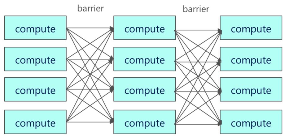
This is really the first of a two-part article dealing with cloud microservices and scientific document analysis.   The work began as I was trying to understand how to build a distributed microservice platform for processing events from Internet sources like twitter, on-line instruments, and RSS feeds.   Stream analytics is another very big topic and I am not attempting to address all the related and significant issues such as consistency and event-time correlation (see a recent blog post by Tyler Akidau that covers some interesting ideas not addressed here.) There are many excellent tools for stream analytics (such as Spark Streaming and Amazon Kinesis and Azure Stream Analytics) and I am not proposing a serious alternative here. This and the following post really only address the problem of how can a microservice architecture be used for this task.

The application: classifying scientific documents by research discipline

It turns out that classifying scientific documents down to the level of academic sub-discipline is harder than it looks.   There are some interesting reasons that this is the case.   First, science has become remarkably interdisciplinary with new sub-disciplines appearing every few years while other topics become less active as the remaining unsolved scientific problems become scarce and hard.   Second a good paper may actually span several sub-disciplines such as cellular biology and genomics.   Furthermore articles in the popular press are written to avoid the deeply technical science language that can help classify them.   For example, a story about the search for life on the moons of Jupiter may be astrophysics, evolution, geophysics or robotics.   Or all of the above.   If the language is vague it may not be possible to tell.   Finally there is the issue of the size of the available data collections. There are about 200 science articles published each day. As an event stream this is clearly not an avalanche.   The work here is based on a harvest of several months of the science feeds so it consists of about 10,000 abstracts.   This is NOT big data.   It is tiny data.

To approach the machine learning part of this problem we need two starting points.

  1. A list of disciplines and subtopics/sub-disciplines we will use as classification targets
  2. A training set.   That is a set of documents that have already been classified and labeled.

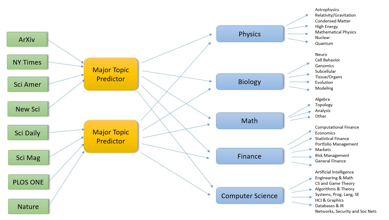
For reasons described below the major disciplines and specific sub-disciplines are

Physics
Astrophysics and astronomy
General Relativity, Gravitation, Quantum Gravity
Condensed Matter Physics
High Energy Physics
Mathematical Physics
Nuclear Physics
Quantum Physics
Biology
Neuroscience
Cell Behavior
Genomics
Evolution
Subcellular Organization
Tissue/Organs
Modeling
Computer Science
Artificial Intelligence & Machine Learning
Engineering & Math Software
CS and Game Theory
Data Structures, Algorithms & Theory
Systems, Programming Languages, Soft Eng
HCI & Graphics
Databases & Information Retrieval
Networks, Security and Soc Nets
Finance
Computational Finance
Economics
Statistical Finance
Portfolio Management
Markets
Risk Management
General Finance
Math
Algebra
Topology
Analysis
Other

Table 1.   Semi-ArXiv based topic and sub-discipline categories.  (ArXiv has even finer gained categories that are aggregated here.)

Unfortunately, for the many of our documents we have no discipline or subtopic labels, so they cannot be used for training.   However the ArXiv[2] collection is curated by both authors and topic experts, so each document has a label.   Consequently we have built our training algorithms to correspond to the discipline subtopics in ArXiv.   In some cases the number of discipline subtopics in ArXiv was so large it was impossible for our learning algorithm to distinguish between them. For example mathematics has 31 subtopics and computer science has 40. Unfortunately the size of the data sample in some subtopics was so tiny (less than a few dozen papers) that training was impossible. I decided to aggregate some related subtopics for the classification. (For mathematics I chose the four general areas that I had to pass as part of my Ph.D. qualification exam! A similar aggregation was used for computer science.)

ArXiv has another discipline category not represented here: Statistics. Unfortunately, the interdisciplinary problem was so strong here that most of Statistics looked like something else.   A large fraction of the statistics articles were in the category of machine learning, so I moved them to the large sub-discipline of CS called AI-ML.   The rest of statistics fell into the categories that looked like applied math and theory so they were moved there.

Using the ArXiv classification as training data worked out well but there was one major shortcoming. They do not have all major science disciplines covered.   For example there is no geoscience, ecology or psychology. (PLOS covers a much broader list of disciplines and we will use it to update this study soon.)   This lack of earth sciences became very noticeable when classifying papers from the popular science. I will return to this problem later.

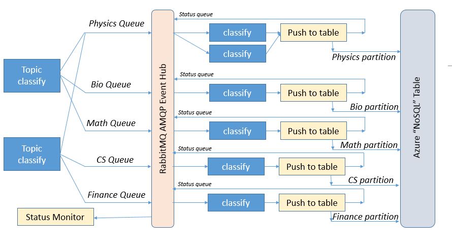
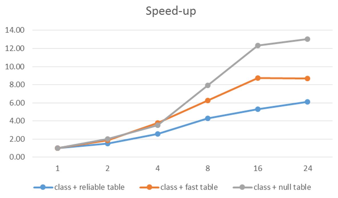
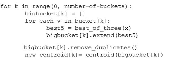
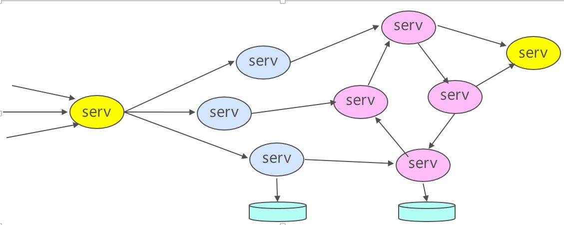
The application is designed as three layers of microservices as shown in the diagram below (Figure 1). The first layer pulls recent docs from the RSS feeds and predicts which major category is the best fit for the document.   It then pushes this document record to second level services specific to that topic. In fact, if our classifier cannot agree on a single topic, it will pick the best two and send he document to both subtopic analyzers.  The second level service predicts which subtopics are the best fit and then pushes the document to a storage service where it is appended to the appropriate sub-discipline

[1] Technically RSS is not a “push” event technology. It needs another service to poll the sources and push the recent updates out as events.   That is what we do here.

[2] FYI: ArXiv is pronounced archive.   Very clever.

architecture

Figure 1.   Basic Microservice architecture for science document classifier (click to enlarge)

The output will be a webpage for each subtopic listing the most recent results in that sub-domain.

What follows is a rather long and detailed discussion of how one can use open source machine learning tools in Python to address this problem.   If you are not interested in these details but you may want to jump to the conclusions then go to the end of the post and read about the fun with non-labeled documents from the press and the concluding thoughts.   I will return to the details of the microservice architecture in the next post.

Building the Document Classifiers

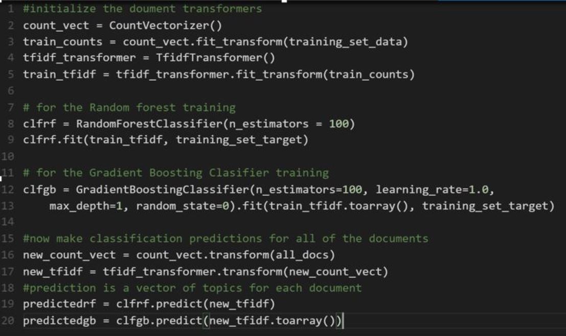
The document analyzer is a simple adaptation of some standard text classifiers using a “Bag of Words” approach.   We build a list of all words in the ArXiv RSS feeds that we have harvested in the last few months. This collection is about 7100 ArXiv documents. The feed documents consist of a title, author list, abstract and URL for the full paper. The ArXiv topic label is appended to the title string.   Our training is done using only the abstract of the article and the topic label is used to grade the prediction.

The major topic predictor and the sub-discipline classifiers both use the same code base using standard Python libraries.   In fact we use five different methods in all.   It is common believe that the best classifier is either a deep neural net or the Random Forest method.  We will look at deep neural nets in another post, but here we focus on Random Forest. This method works by fitting  a large number of random binary decision trees to the training data.   Another interesting classifier in the Scikit-Learn Python library is the Gradient Tree Boosting algorithm. This method uses a bunch of fixed size trees (considered weak learners) but then applies a gradient boosting to improve their accuracy. In both cases it is the behavior of the ensemble of trees that is used for the classification.

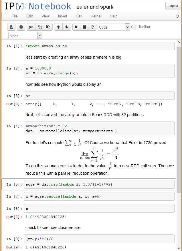
For any Bag-of-words method you first must convert the words in the training set into a dictionary of sorts so that each document is a sparse vector in a vector space whose dimension is equal to the number of words in the dictionary.   In this case we use a “count vectorizer” that produces a matrix of word token counts.   We then apply a Term Frequency – Inverse Document Frequency (TFIDF) normalization to a sparse matrix of occurrence counts. This is a sparse matrix where each row is a unit vector corresponding to one of the training set documents.  The size of the row vector (the number of columns) is the size of the vocabulary. The norm of the row vector is 1.0.   In the code, shown below, we then create the random forest classifier and the gradient tree boosting classifier and train each with the training data.

make-rf-gb

Figure 2.  Sample Python code for building the random forest and gradient tree boosting classifiers.

Finally we make a prediction for the entire set of documents in the ArXiv collection (all_docs in the code above).   This is all pretty standard stuff.

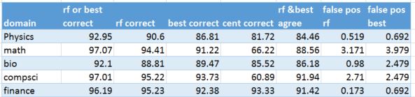
The training set was a randomly selected subset of ArXiv data. Using a relatively small training set of no more than 400 of the documents from each category we got the following results. With five major categories that represents about 33% of all of the ArXiv documents.   This provided a correct classification for 80% of the data using only the Random Forest Classifier.   Unfortunately the distribution of documents among the various categories is not uniform. Physics and Math together constitute over half of the 5500 documents.   Using a larger training set (75% of the documents from each category) gave a stronger result. However, when we use both Random Forest (RF) and Gradient Boosting (GB) and consider the result correct if either one gets the answer right, we get a success rate 93%. Looking more closely at the numbers, the success rate by topic is shown below.   We have also listed the relative false positive rate (100*number of incorrect predictions/the total size of the category)

Major topic % RF or GB correct % relative false positive rate
Physics 97.5 3.2
Math 92.3 14.6
Bio 88.9 1.6
Compsci 86.8 9.7
Finance 90.8 2.8

Table 2.   Basic top-level classifier results with success percentage if one of the two methods are correct.   The relative false positive rate is
100*total incorrect predictions of a document belonging to domain-x/sizeof(domain-x)

It is also worth noting that RF and GB agree only about 80% of the time and RF is only slightly more accurate than GB.   The false positive rates tell another story.   For some reason Mathematics is over predicted as a topic.   But there are additional more sociological factors at work here.

The choice of the ArXiv label often reflects a decision by the author and tacit agreement by the expert committee.   For example the article titled

“Randomized migration processes between two epidemic centers.”

Is labeled in ArXiv as [q-bio.PE] which means quantitative biology, with the sub area “population and evolution”.   This paper is illustrates one of the challenges of this document classification problem.   Science has become extremely multidisciplinary and this paper is an excellent example.   They authors are professors in a school of engineering and a department of mathematics. If you look at the paper it appears to be more applied math then quantitative biology. This is not a criticism of the paper or the ArXiv evaluators.   In fact this paper is an excellent example of something a quantitative biologist may wish to see. The Random Forest classifier correctly identified this as a biology paper, but the gradient boosting method said it was math. Our best of three (describe below) method concluded it was either computer science or math.   (In addition to some rather sophisticated mathematics the paper contains algorithms and numerical results that are very computer science-like.)

All of this raises a question.   Given a science article abstract, is there a single “correct” topic prediction? Textbooks about machine learning use examples like recognizing handwritten numerals or recognizing types of irises where there is a definitive correct answer.   In our case the best we can do is to say “this document is similar to these others and most of them are in this category, but some are in this other category”.   Given that science is interdisciplinary (and becoming more so) that answer is fine.   The paper should go in both.

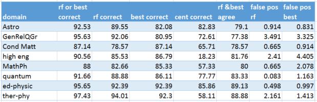
This point can be further illustrated by looking at the subtopic level where the distinction between sub-disciplines is even more subtle.   Physics is the most prolific science discipline in the ArXiv.   It has many sub-discipline topics.   For our purpose we have selected set listed in Table 1.   Our classifier produced the following results when restricted to Physics using a training set consisting of 75% of the items in each category but no more than 200 from each.   The overall score (either RF or GB correct) was 86%, but there were huge false positives rates for General Relativity (GR-QG) and High Energy Physics (HEP) where we restricted HEP to theoretical high energy physics (HEP-th).

Sub-discipline %correct 100*relative false positive rate
Astrophysics 88.5 6.24
General Relativity & Quantum Grav 89.4 28.33
Condensed Matter 74.7 0.0
High Energy Physics 77.8 21.4
Mathematical Physics 73.7 0.0
Nuclear Physics 66.7 0.0
Quantum 74.6 0.0

Table 3.  Classifier results for Physics based on RF or GB predicting the correct answer

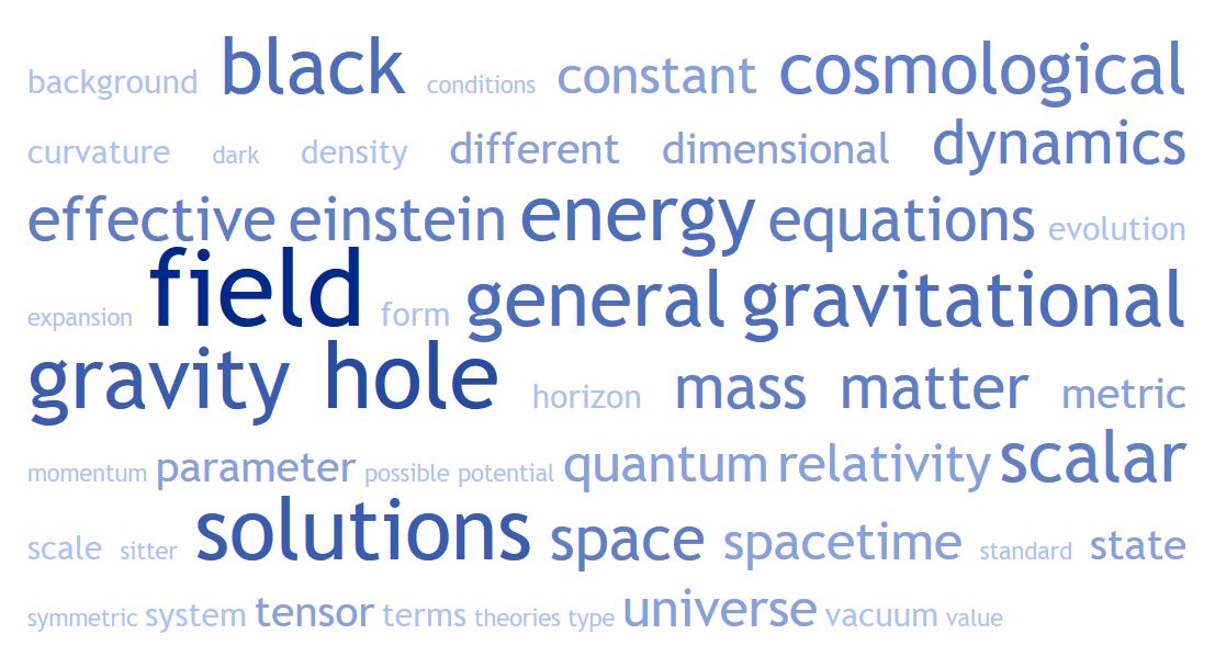
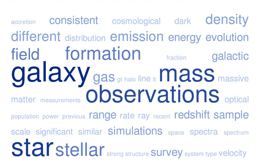
In other words the system predicted General Relativity in places were that was not the correct category and High energy physics also incorrectly in others.   These two subtopics tended to over-predict. A closer look at the details showed many HEP papers were labeled as GR-QG and visa-versa.   There is a great way to see why.   Below are the “word cloud” diagrams for HEP, GR-QC and Astrophysics.   These diagrams show the relative frequency of words in the document collection by the size of the font.  Big words are “important” and little ones less so.   As you can see, the HEP and GR-QC word clouds are nearly identical and both are very distinct from Astrophysics.

GenRelQGr

Figure 3.  Word cloud for documents in General-Relativity  and Quantum Gravity

high_engFigure 4.  Word cloud for Theoretical High Energy Physics documents

Astro

Figure 5.  Word cloud for Astrophysics

(Restricting the High Energy Physics category to only Theoretical papers caused this problem and the results were not very valuable, so I added additional subcategories to the HEP area including various topics in atomic physics and experimental HEP. This change is reflected in the results below.)

A Clustering Based Classifier

Given the small size of the training set, the random forest method described above worked reasonably well for the labeled data. However, as we shall see later, it was not very good at the unlabeled data from the popular press.   So I tried one more experiment.

There are a variety of “unsupervised” classifiers based on clustering techniques.   One of the standards is the K-means method.   This method works by iterating over a space of points and dividing them into K subsets so that the members of each subset are closest to their “center” than they are to the center of any of the others clusters.   Another is called Latent Sematic Indexing (LSI) and it is based on a singular value decomposition of the document-term matrix.   And a third method is called Linear Discriminant Analysis (LDA) which build linear expressions of features that can be used to partition documents.

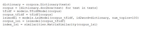
The way we use these three methods to build a trained classifier is a bit unconventional.   The basic idea is as follows.   Each of the three methods, K-means, LSI and LDA has a way to ask where a document fits in its clustering scheme.   In the case of K-means this is just asking which cluster is nearest to the point represented by the document.   We use the LSI and LDA implementations from the excellent gensim package. In the case of LSI and LDA, we can use a special index function which performs a similarity query.

As before we begin by converting documents into unit vectors in a very high dimension space.   We begin with the list of documents.

The list of words from these abstracts is then filtered to remove Standard English stop words as well as a list of about 30 stop words that are common across all science articles and so are of no value for classification.   This includes words like “data”, “information”, “journal”, “experiment”, “method”, “case” etc. Using the excellent pattern Python package from the Computational Linguistics & Psycholinguistics Research Center at the University of Antwerp, we extract all nouns and noun phrases as these are important in science.   For example phrases like “black hole”, “abelian group”, “single cell”, “neural net”, “dark matter” has more meaning that “hole”, “group”, “cell”, “net” and “matter” alone.   Including “bi-grams” like these is relatively standard practice in the document analysis literature.

For each document we build a list called “texts” in the code below. texts[i] is a list of all the words in the i-th document.   From this we build a dictionary and then transform the Text list into another list called Corpus. Each element in Corpus is a list of the words in the corresponding document represented by their index in the dictionary.   From this corpus we can build an instance of the LSI or LDA model.   We next transform the corpus into tfidf format and then into the format LDA or LSI need.   From these we create an index object that can be used to “look up” documents.

code-2

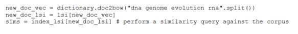
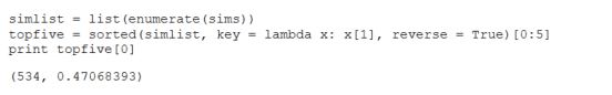
For example, suppose I have a new four-word document “dna genome evolution rna” and I want to find the abstracts in our collection that are most similar.
code-3
Index_lsi (or Index_lda) returns a list of floating point numbers where the i-th number is the similarity in lsi space to our new document.   To find the top five most similar documents we enumerate and sort the list. Looking at the head of the list we have

code-4

Document 534 is one with title “Recombinant transfer in the basic genome of E. coli” and is indeed a good match for our rather short query document.

The best of three classifier

So now we have three ways to find documents similar to any given document.   Here is how we can use it to build a crude classifier we call “best-of-three”.

  1. Assume you have n target categories.   At the top level we have n = five: Physics, Biology, CS, Math and Finance.
  2. Sort the training set of documents into n buckets where each bucket consist of those documents that correspond to one of the categories. So bucket 1 contains all training documents from physics and bucket 2 has all training documents from Biology, etc.
  3. Given a new document x we compute the top 5 (or so) best matches from each of the three methods (KM, LSI and LDA) as shown above.   We now have 15 (or so) potential matches.
  4. We now have 15 (or so) potential matches. Unfortunately each of the three methods uses a different metric to judge them and we need to provide a single best choice. We take a very simple approach. We compute the cosine distance between the vector representing the document x and each of the 15 candidates.   The closest document to x is the winner and we look to see in which bucket that document lives and the label of that bucket is our classification.

The Centroid classifier

Unit length vectors are points on a high dimensional sphere. The cosine distance between two vectors of unit length is simply the distance between those points.  Because the best-of-three method uses the cosine distance as the final arbiter in a decision process we can envision an even simpler (and very dumb) method.   Why not “summarize” each bucket of training set items with a single vector computed as the “centroid” of that set of training set documents. (By centroid here we mean the normalized sum of all the vectors in training set bucket k. )  We can then classify document x by simply asking which centroid is closest to x.   This turns out to be a rather weak classifier. But we can improve it slightly using he best-of-three method.   For each bucket k of documents with training label k, we can ask KM, LDA and LSI which other documents in the training set are close to those elements in k.   Suppose we pick 5 of the nearby documents for each element of the bucket and add these to an extended bucket for label k as follows.

best-algorithm

We now have buckets that are larger than the original and the buckets from different labels will overlap (have non-trivial intersections).   Some physics documents may now also be in computer science and some math documents will now also be in biology, but this is not so bad.   If it is labeled as being in physics, but it looks like computer science then let it be there too.

The Results

We now compare the methods RandomForest (rf), Best-of-Three (best) and the new centroid classifier (cent) against each other for all the labeled data.   The results are complicated by two factors related to the selection of the training sets.   The balance between the numbers of papers in each subcategory is not very good.   At the top level, physics has thousands of papers and finance has only a few hundred. Similar imbalances exist in all of the individual disciplines.   Consequently if you take a random selection of X% of the labeled data as the training set, then the prolific disciplines will be heavily represented compared to the small disciplines.  The result is that the false positive rates for the heavy disciplines can be extremely high (greater than 10%  of all documents.)  On the other hand if you take a fixed number of papers from each discipline then the training set for the big disciplines will be very small. The compromise used here is that we take a fixed percent (75%) of the documents from each discipline up to a maximum number from each then we get a respectable balance, i.e. false positive rates below 10% . The table below is the result for the top level classification.

final-allTable 4.  Top-level results from 7107 labeled documents with a training set consisting of 63% (with a maximum of 1500 documents from each sub-discipline.)

(In Table 4 and the following tables we have calculated the “correct” identifications as the percent of items of domain x correctly identified as being x.  This is the same as “recall” in the ML literature. The “false pos” values is the percent of items incorrectly identified as being in category x.  If n is the total number of documents and m is the number identified as physics but are not physics then the table represents 100*n/m in the physics column.  This is not the same as the textbook definition of false positive rate. )

In the tables below we show the results for each of the disciplines using exactly the same algorithms (and code) to do the training and analysis.

final-phyTable 5.  Physics sub-domain consisting of 3115 documents and a training set of 53%.  (300 doc max per subcategory)

final-math

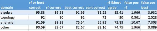
Table 6.  Math sub-domain consisting of 1561 documents and a training set size of 39% (200 doc max per subcategory)

final-bio

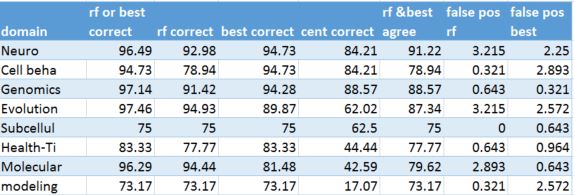
Table 7.  Biology sub-domain consisting of 1561 documents and a 39% training set size (200 docs max size per subcategory)

final-cs

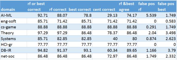
Table 8.  Computer Science sub-domain consisting of 1367 documents and 56% training set size (200 doc max docs per subcategory)

final-finance

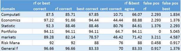
Table 9.  Finance sub-domain consisting of 414 documents and a 64% training set size (50 documents max per subcategory)

 As can be seen from the numbers above that Random Forest continues to be the most accurate, but the Best-of-Three method is not bad and in some cases outperformed Random Forest.   And, because we assume that science is very interdisciplinary, we can use both methods as a way to push documents through our system.   In other words if bf and best agree that a document belong in category X, then we put it there.   But if they disagree and one says category X and the other says category Y, then we put the document in both.

Non-labeled documents

Now we turn to the non-labeled data coming from the RSS feeds from Science Daily, Scientific American, New Scientist, Science Magazine and the New York Times.   The reader may wonder why we bothered to describe the centroid method and list its performance in the table above when it is clearly inferior to the other methods on the labeled ArXiv data.   The surprise is that it beats the Random Forest and Best-of-Three on the popular press data.

I do not have a good explanation for this result other than the fact that the popular press data is very different from the clean scientific writing in science abstracts. Furthermore the science press feeds are often very short.   In fact they often look more like tweets.   For example, one from Science Daily reads

“Scientists have found that graphene oxide’s inherent defects give rise to a surprising mechanical property caused by an unusual mechanochemical reaction.”

The subject here is materials science and the Best-of-Three algorithm came the closest and called this physics. In other cases all the algorithms failed. For example from the science day feed this article

“While advances in technology have made multigene testing, or \’panel testing,\’ for genetic mutations that increase the risk of breast or other cancers an option, authors of a review say larger studies are needed in order to provide reliable risk estimates for counseling these patients.”

was determined to be “Finance” by all three algorithms.

And there were many posts that had no identifiable scientific content.   For example
“Casual relationships, bittersweet news about chocolate, artisanal lightbulbs and more (full text available to subscribers)”

or

“If social networks were countries, they’d be police states. To change that we may have to rebuild from the bottom up.

or

“Footsteps of gods, underground dragons or UFOs? Rachel Nuwer joins the fellowship of the rings out to solve the enigma in the grassy Namibian desert.”

This does not mean these stories had no scientific or educational value.   It only means that the abstract extracted from the RSS feed was of no value in making a relevance decision.

Another major problem was that our scientific categories are way too narrow. A major fraction (perhaps 70%) of the popular press news feeds are about earth science, ecology, geophysics, medicine, psychology and general health science.   For example, the following three have clear scientific content, but they do not match our categories.

“Consumption of sugary drinks increases risk factors for cardiovascular disease in a dose-dependent manner — the more you drink, the greater the risk. The study is the first to demonstrate such a direct, dose-dependent relationship.”

“Nearly a third of the world’s 37 largest aquifers are being drained faster than water can be returned to them, threatening regions that support two billion people, a recent study found.”

“While the risk of suicide by offenders in prison has been identified as a priority for action, understanding and preventing suicides among offenders after release has received far less attention.”

By extracting a random sample of 200 postings and removing those that either had no scientific content or no relationship to any of our main disciplines, the results were that Centroid was the best classifier of the remainder correctly identifying 56%.   Best together with Centroid the success rate rose to 63%.   Random forest only correctly identified 16% of the papers because it tended to identify many papers as mathematics if the abstract referred to relative quantities or had terms like “increased risk”.

Final Thoughts

The greatest weakness of the approaches I have outlined above is the fact that the methods do not provide a “confidence” metric for the selections being made. If the classifier has no confidence in its prediction, we may not want to consider the result to be of value.   Rather than putting the document is the wrong category it can be better to simply say “I don’t know”.   However it is possible to put a metric of “confidence” on Best and Centroid because each rank the final decisions based on the cosine “distance” (actually for the unit length vectors here, the cosine is really just the dot product of the two vectors).   The nearer the dot product is to 1.0 the closer two vectors are.

For the Centroid method we are really selecting the classification category based on the closest topic centroid to the document vector.   It turns out that for the majority of the public press documents the dot products with the centroids are all very near zero. In other words the document vector is nearly orthogonal to each of the topic centroids. This would suggest that we may have very little confidence in the classification of these document. If we simply label every document with a max dot product value less than 0.04 as “unclassifiable” we eliminate about 90% of the documents. This includes those documents with no clear scientific content and many of those that appear to be totally unrelated to our five theme areas.   However, if we now compute the true positive rate of the centroid classifier on the remainder we get 80% correct.   For Best or Centroid together we are now over 90% and RF is up to 35% (now slight above a random guess).

We can now ask the question what max dot product cutoff value will yield a true positive rate of 90% for the centroid method? The table below shows the true positive value and the fraction of the document collection that qualify for dot product values ranging from 0.04 to 0.15 (called the “confidence level” below.

confidence

Another way of saying this is that if the maximum of the dot products of the document vector with the topic centroids is above 0.05 the chance of a correct classification by the Centroid method is above 90%.   Of course the downside is that the fraction of the popular press abstracts that meet this criteria is less than 7%.

Next Steps

The two great weaknesses of this little study are the small data set size and the narrowness of the classification topics.   The total number of documents used to train the classifiers was very small (about 6,000).   With 60,000 or 600,000 we expect we can do much better.   To better classify the popular press articles we need topics like geoscience, ecology, climate modeling, psychology and public health. These topics make up at least 70% of the popular press articles. In a future version of this study we will include those topics.

Another approach worth considering in the future is an analysis based on the images of equations and diagrams. Scientists trained in a specialty can recognize classes of scientific equations such as those for fluid dynamics, electromagnetism, general relativity, quantum mechanics or chemical reaction diagrams or biochemical pathways, etc.   These images are part of the language of science.   Image recognition using deep neural networks would be an ideal way to address this classification problem.

In the next post I will describe the implementation of the system as a network of microservices in the cloud.   I will also release the code use here for the document training and I will release the data collection as soon as I find the best public place to store it.

Programming the Cloud with Microservices, Docker and Mesosphere

Introduction

The cloud is designed to be a host for applications that are realized as scalable services. For example a web server or the backend of a mobile app. In this case the application accepts random connections from remote clients and, based on the client’s request, it does some computation and returns a response. If the number of clients that are concurrently requesting service grows too large for one server to handle, the system should automatically spawn new instances of the server to share the load. Another scenario is an application that processes events from remote sensors to inform a control system on how to respond.   For example, geo-sensors detecting ground motion tremors occurring in a significant pattern, then sound an earthquake warning.   In this case the cloud part of the application may involve multiple components: sensor signal decoders, pattern analysis integrators, database searches, and alarm system interfaces.   Another example is a large-scale data analytics system processing large amounts of text data. For example, a search index for the World Wide Web.

Each of these cloud applications illustrates one of three basic paradigms of programming the cloud. They are

Basic web server gateway. A single server that responds to requests from a user. Scaling is accomplished by replication. We will discuss this further in another section on Dockerized Science Gateways.

Bulk Synchronous Parallel methods. This is a very old and respected model for parallel programming characterized by running computation in a sequence of phases where each phase involves a single task that is executed in parallel on multiple servers. When the tasks terminate a barrier synchronization is used to permute the data so that the second phase of computation can begin.   For example, Spark commands from the Scala REPL or Python API operate on distributed data collections in this manner.   Hadoop Map Reduce is essentially a BSP program.

bsp

An asynchronous swarm of communicating processes distributed over a virtual network in the cloud.   The individual processes may be stateless, such as a simple web service or stateful such as found in the actor programming model.

async-swarm

An excellent example of a tool for programming asynchronous swarms via actors is Orleans from Microsoft Research http://research.microsoft.com/en-us/projects/orleans/.   Orleans has been used internally at Microsoft on some very large scale projects including the game Halo Online and it is now available as open source.

Microservices

Recently this asynchronous swarm style has been rebranded with a new philosophy under the name “Microservices’’. The problem addressed by microservices is that of how to design and build a large, heterogeneous app so that it will be secure, maintainable, fault tolerant and scalable? This is particularly important for very large, on-line services that need to support thousands of concurrent users. The app must remain up twenty-four hours a day but still maintained and upgraded. The software engineering approach to this problem is called “Dev Ops” and it integrates product delivery, quality testing, feature development, and maintenance releases in order to improve reliability and security and provide faster development and deployment cycles.   From the programmer’s perspective this is a “you built it, so now you run it” philosophy. Updates to parts of this system occur while the system is running so there is a very tight integration of the developers with the IT-pros managing the system.

The microservice solution to this challenge is to partition the app into small, independent service components communicating with simple, lightweight mechanisms. The microservice paradigm design rules dictate that each microservice must be able to be managed, replicated/scaled, upgraded and deployed independent of the others microservices. Each microservice must have a single function and operates in a “bounded context”, i.e. having very limited responsibility and limited dependence on other service. When possible one should reuse existing trusted services such as databases, caches, directories, etc. All microservices should be designed for constant failure and recovery. The communication mechanisms used are varied and include REST web service calls, RPC mechanisms like SWIFT and the Advance Message Queueing Protocol AMQP system that are common in IoT applications and are well supported in the commercial clouds.

The microservice philosophy has been adopted in various form by many companies including Netflix, Google, Microsoft, Spotify, Amazon and others.

Docker, Swarm, Kubernetes and Mesosphere

To build a substantial microservice application one needs to build on a platform that can manage large collections of distributed, communicating services. Thanks to the open source movement we now have an excellent collection of tools for building and managing microservices.   These are

  1. Containers. This revolutionary technology that allows us an alternative to deploying services as heavy-weight virtual machines.   “Containers” run on a host OS and use basic services such as kernel namespaces and resource isolation provided by that OS. Docker containers contain all the OS components and libraries needed by the app, various user-added files and apps and instructions for what process to run. Docker exploits the host OS namespaces for isolation, control groups for resource management.   It uses the Union File Systems so that containers are built as layers on existing FS. The company Docker.com also provides a registry of dockerized tools and application that can be downloaded. We show an example of using Docker and the registry in another section.
  1. CoreOS. As noted the host OS for Docker need not be very heavy because each container will have its own OS features and libraries required by the application. CoreOS is a basic “stripped down” version of Linux that contains only those tools needed to support Docker containers.

The tools for managing clusters of microservices hosting containerized microservices are many.   The ones we have tested are

  1. Swarm. Docker.com provides a tool for managing clusters of servers running Docker container instances. We tested Swarm on Azure using the client Docker-machine and it was relatively easy to bring up a cluster of machines and deploy apps.   Swarm shows great promise but it is still beta quality and we found the documentation still rather sparse.
  2. Kubernetes was recently released by Google and is based on the cluster management tools they use. We also found it relatively easy to deploy Kubernetes on Azure using another tool called Weave to support the networking.   Kubernetes has an important feature not present in the other microservice cluster management tools.   In Kubernetes every container lives inside a “pod”.   Pods can contain a single Docker container instance or several instances.   This is important because often a single microservice instance may always collaborate with another microservice instance of the same or different type. For example a Dockerized web server may need a private instance of a Redis cache or SQL database.   These are relatively standard docker components, so there is no reason to deploy them in your web server container.   Because each pod instance runs on a single server, the containers in the same pod share resources such as private directories. Communication within a server is going to be faster and more reliable than communication across the network.
  3. Mesosphere. One of the many products from the UC Berkeley AMP lab was a distributed computing operating system (dcos) called Mesos.   It has since been spun off as a startup called Mesosphere.com.   Mesosphere installed easily on Azure and it has proven to be extremely reliable.   Because we use it so extensively we have an addition page about it here.
  4. Microsoft Azure Service Fabric. Microsoft recently released a development kit for a microservice orchestration framework that they have been using internally for a while. The SDK is easy to install into visual studio and it comes with an emulator so you can start building apps. I have not yet had a chance to try the full deployment.   Mark Russinovich has a nice blog about this and an online video of a talk he gave describing the system.

In the next post, we will describe our experience building a microservice application to do document classification using machine learning tools.   However if you want to get a feeling for how one can use Mesosphere and Python to build simple microservices, then we have a page where we show you all the gory details.  It is called “Fun with Mesosphere and Microservices“.

A Cloud Gathering and Reflections on a Panel.

There are a lot of Cloud computing conferences these days. IEEE Cloud 2015 will be held in New York on June 27th and the ACM Symposium on Cloud Computing will be held in August in Hawaii and various regional conferences and workshops on cloud themes abound. The 2015 IEEE International Conference on Cloud Engineering was held this last week in Tempe Arizona, USA. This is the third instance of the conference and there is every indication that it is gathering a reputation as a strong, technically oriented event.

Environmental Sustainability and the Cloud

There were several interesting research trends that were apparent at this year’s event.   The first of these was a clear recognition that cloud engineering is much more than the mechanics of data centers construction and optimization.   Highlights of the meeting included two panel sessions. One panel led by HJ Siegel looked at the issue of sustainability.   My assumption was that this was going to be a discussion of business models for cloud vendors, but the topic that was discussed was much more interesting. Can the expansion of cloud infrastructure keep pace with our exponentially growing demand for new apps and services? Can the planet sustain the growing energy requirements of the cloud?  Or is a positive side to the story? The data center is just one part of the big cloud of interconnected devices and networks.    The public cloud vendors have been working for several years building data centers that are driven by renewable energy such as wind, geothermal, hydroelectric and solar and many of the newest data centers are carbon neutral.   But the data centers are only a one part of energy used by our ubiquitous information-rich lives.   Getting the data on how much energy is used by our systems is a non-trivial task. One fascinating report is provided by Greenpeace (April 2014). In terms of shares of the total pie of cloud related energy consumption the cloud data centers represent about 20% of the total, the network itself represent about 23% and the remaining 57% is consumed by our devices.  In terms of total global energy demand the cloud ranks 6th in total use (behind China, US, Japan, India and Russia and ahead of Germany, Brazil, Canada France and the UK.) This world-wide cloud generates 2% of global emissions which is apparently similar to that produced by the global aviation sector.

There are some surprising observations that have been made about the way the cloud uses energy. A McAfee’s report “The Carbon Footprint of Spam” concludes that approximately 62 trillion spam emails are sent each year consuming 33 billion kilowatt hours of electric power which translates into greenhouse gas emissions equal to 3.1 million cars on the road using at least 2 billion gallons of gasoline. Streaming data sources also account for a large part of the cloud traffic.   Netflix and YouTube together account for 47% of prime time internet traffic. According to the digital power group, streaming an hour of Netflix every week uses more power than two refrigerators running for a year. And a growing number of data-collecting cell phone apps are sending vast streams of data back to the app developers. One participant at the meeting referred to this as the “dark matter” of the Internet.

Geoffrey Fox led a second panel at the conference that took up the topic of the “Internet of Things (IoT)”.   It is anticipated that 50 billion devices will be on the network by 2020. This number represents a continuation of the exponential growth of the cloud as shown below.

iot_size

The potential for overloading the communication fabric and adding additional stress on the environment is there, but there is also great potential for the IoT to help us manage our planet and its use of resources.   Cities are becoming “smart” and using sensors and instruments to better manage and plan our urban environments. Urban Science is growing as a data intensive discipline. But the IoT goes well beyond our urban areas. Data gathering instruments in sensitive ecological zones can monitor human impact and alert us to ways we must take action.   We are starting to see progress on the ocean observing network of sensors that can help us better understand the impact of climate change on aquatic life.   One topic that came up in the panel is an observation that the cloud data centers cannot be the home for all of this IoT data.   We must continue to build data analysis facilities at the edge of the network to do initial analysis and response. Large scale data analysis can be done on summarized data streams in the big data centers.   Elizabeth Kolbert in her new book makes the argument that we are in the middle of the sixth great extinction and human impact is the cause. Unless we can understand the planet — and our impact on it — as a single system, we have little hope of avoiding some very bad outcomes.   This IoT is becoming one of the key instruments needed to understand this system.

Back to Cloud Engineering.

Sustainability and the IoT were certainly not the only contributions of the meeting. The conference had very interesting sessions on security and modeling and simulation and other engineering topics.   In addition there were attached workshops on software defined systems and container technology for clouds.   The conference concluded with a brilliant keynote talk by Douglas Terry on important and practical models of cloud data consistency.

The conference next year will be in Berlin.   It should be fun.

Docker and Containers of Science.

A few years ago we thought that the best way to encapsulate software for deployment in the cloud was to create a virtual machine image and store it in a repository for Amazon images or the Microsoft VM depot. Then anybody could grab the image and spin it up on the appropriate data center. Unfortunately virtualization tools are not all the same, so running a VM from Amazon on Azure or other cloud was a real problem. I sat through endless debates with my science colleagues that usually went something like this. “This is just another form of evil vendor LOCK-IN!” We spent a great deal of time thinking about ways to address this evilness.

While this was going on other folks realized that the Linux Kernel had some cool features like namespace isolation and control groups that provides ways to bound the resource utilization of processes. By the middle of 2013 a little company called dotCloud released a tool that would provide a better way to deploy encapsulated application and this became Docker and Docker, Inc. Microsoft also figured out how to do the same thing with Windows and they are said to release a Docker capable version of Windows Server soon.

What is Docker and why does it change the game? Docker allows applications to be provisioned in “containers” that encapsulate all application dependencies.   The application sees a complete, private process space, file system and network interface that is isolated from applications in other containers on the same host operating system.   Once the basic Docker framework and library are installed on the host OS, loading and bringing up a container stored in the Docker archive requires one command and takes only as long as it takes to download the container binary.   Because container images are so much smaller than a VM image, the download is very fast. And starting a new instance of a cached container image takes only a few seconds. Docker isolation provides a great way to factor large applications and there are simple ways for running containers to communicate. (This is a great way to avoid the “jar hell” that was so common in big Java applications when different app components require libraries or environments that are in conflict.) It took only a few mouse clicks to install Boot2Docker on my little Microsoft Surface and another minute to spin up a container with the IPython notebook. (If you try this at home, note that Boot2Docker conflicts with Hypervisor so you need to turn HyperV off.) To make life even easier another new company called CoreOS has a stripped down distribution of Linux that is designed for large-scale cloud deployment and Docker is built-in.

Docker is designed to support a variety of distributed applications and it is now widely used in the “Internet industry” (including folks like YELP*, Spotify, Baidu, Yandex, eBay) and supported by the public cloud providers Google, Microsoft, Amazon and IBM.   Loading CoreOS as a VM on Azure was easy and bringing up Docker instances on it was trivial.

Where’s the Science?

At this point many of you readers may say, “We know all this. Where have you been the last year?” The point of this post is to call out the impressive collection of scientific applications that have been containerized. My exploration of this began with a nice chat I had with two bioinformatics researchers who were interested in using a public cloud for their work. I asked them which tools they were using. They told me and I thought there must be Docker containers for that software. Sure enough, they were there.   In fact there are example that are appearing every day.   Here is a short list that I found on the Docker repository.

  • Radio Astronomy tools including containers for LOFAR, pyimager and meqtrees.
  • Chemical Informatics libraries from the chemtoolbox
  • Bioinformatics. The ever popular Galaxy toolkit is available in various forms. The University of Hamburg genome toolkit is also available.
  • For Mathematics and Statistics there is, of course, R and Python with numpy etc in various combinations.
  • For Machine Learning there is the complete collection of ML algorithms written in Julia, many versions of Spark, the Vowpal Wabbit tools and the Scikit-learn python tools.
  • For Geospatial data there is a container with geoserver
  • For digital archival and data curation there is a container for dspace and irods
  • The NSF iPlant consortium has developed the Agave science-as-a-service platform and the various components of that are now containerized.

Each of these allow you to spin up a running instance of the software in seconds on a Docerized server like CoreOS or Ubuntu (after a Docker install) or Windows with Boot2Docker.   So all the problems of science in the cloud are solved. Correct? Of course not. What if you want to run a cluster of Docker Containers that are sharing you large workloads? Or running a big Spark deployment?

The challenge with Docker is managing multiple Azure servers each with multiple Docker containers.   There are four major open source solutions to this problem.

  • Mesos is a distributed systems kernel for managing large numbers of servers.   Originally developed as part of the Berkeley Amplab, it is now supported by a startup, Mesosphere.
  • Kubernetes is a technology released by Google and endorsed by Microsoft and others.   Kubernetes is designed to manage groups of containers. It allows users to ask a cluster to run a set of containers. The system automatically chooses hosts to run those containers on.
  • Weave is an overlay network for Docker that allows Docker clusters from different data centers or even different cloud vendors to be tied together.   Weave runs on Google and AWS and Weave has been ported to Azure by Patrick Chanezon.
  • Swarm is another tool developed by the Docker team to manage a cluster of containers. We know of no ports of Swarm to Azure.

These tools can be used together in various combinations.   In our next post we will report on our experience using these tools to build a cluster application.

One final note.  Docker does not solve the entire vendor Lock-In issue.  There is still the data.  Depend upon where you put big data collections the laws of computational physics will draw your computing to it.  At least Docker makes it ease for that computing to move.

UPDATE:

Henrik Nordborg just pointed me to TheUberCloud were a very large number of containerized science and engineering application have been deployed on a number of cloud platforms.  More details later when I have a better  understanding of what they have done.  What I see now looks very impressive.

Interactive Data Analysis with Spark in the Cloud with Brisk

In this post we explore the IPython notebook on Azure via Elastacloud’s new Brisk Spark Service. We also look at Spark’s parallel scalability performance using a simple example.

Data analytics is about data exploration and that is an activity that is best done interactively. By interactive exploration we mean the ability to load a dataset into a system and then conduct experiments with different transformations and visualizations of the data. Interactive systems allow you to apply different analysis or machine learning algorithms and then experiment with different parameters to optimize the results. We have had great desktop tools for interactive data analysis for many years. Excel, Matlab, R, Mathematica are all superb in that they integrate a great computational library with graphics.   Mathematica demonstrated the power of journaling data exploration with an interactive electronic notebook. And the Scientific Python community has rallied around the IPython notebook.  This notebook is actually a web server that allows your browser to host the notebook files that you can interact with while Python runs in the background.   The good folks at Continuum Analytics provide the Anaconda package that contains all you need to deploy the Python, IPython, the scientific libraries including numpy, scipy and scikit-learn and the IPython notebook.   It is trivial to run the notebook on your laptop and interactively build and visualize python data analysis solutions. Individual notebooks can be published and shared with the notebook viewer nbviewer.

There is a major limitation to these desktop computing solutions. They are limited to the computing power and data capacity of your personal machine.   “Big Data” is a term that is frequently used without a precise definition.   I believe there is a very reasonable translation.   “Big Data” means too big to fit on your laptop. And the way you handle big data is to distribute it over multiple compute and storage nodes where you can apply parallel algorithms to the analysis.

If you have a supercomputer, you can submit batch analysis jobs, but if you want an interactive experience you must have a way for the user to submit individual commands to be executed followed by a response from the machine before another command is sent. This pattern is called a “read-eval-print-loop”, or REPL and the idea is as old as the hills. But for big data problems you need to do this with the user at a web browser or desktop app communicating with a massively parallel analysis engine in the back end. This has been done using Matlab clusthinkerclustertering and the IPython notebook has a built-in parallel cluster tool.   More recently there is great interest in Torch and the LuaJIT programming environment. Torch is extremely strong in machine learning algorithms and exploits GPU parallelism with an underlying C/CUDA implementation.

Spark with IPython Notebook.

In this blog I want to talk about my experience using the IPython Notebook with the Spark analysis framework. Using the IPython notebook with Spark is not new. Cloudera described this in a blog post in August of 2014 and it is described in the Spark distribution. My goal here is to talk about how it fairs as an interactive tool for data analysis that is also scalable as a parallel computing platform for big data.

Spark is a product of the very prolific Berkeley AMP lab. It is now supported by Databricks.com who also provide an on-line service that allows you to deploy an instance of Spark on an Amazon AWS cluster. The Databricks Workspace contains a notebook that support SQL, Scala (the implementation language for Spark) and IPython. This same workspace also includes a way to transform a notebook into an online dashboard with only a few mouse clicks. This is an extremely impressive tool. Databricks is not the only company to make Spark a cloud service. The U.K. company Elastacloud has produced a new Brisk service that provides Spark on Microsoft’s Azure cloud. I will focus my discussion on experience with Brisk and a simple deployment of Spark on a 16 core Azure Linux VM server.

I describe Spark in greater detail in another section, however a brief introduction will be important for what follows.   Spark is a cluster data analysis engine that consist of a master server and a collection of workers. A central concept in Spark is the notion of a Resilient Distributed Dataset (RDD) which represents a data collection that is distributed across servers and mapped to disk or memory. Spark is implemented in Scala which is an interpreted statically typed object functional language.   Spark has a library of Scala “parallel” operators that perform transformations on RDDs.   This library also has a very nice Python binding.   These operators are very similar to the Map and Reduce operations that were made popular by the Hadoop data analysis engine.   More precisely Spark has two types of operations: transformations which map RDDs into new RDDs and actions which return values back to the main program (usually the read-eval-print-loop).

To illustrate these ideas look below at a sample from an IPython notebook session using Spark. In this example we create a one dimensional array of integers and then we convert this to an RDD that is partitioned into 32 pieces.   In Spark the partitions are distributed to the workers. Parallelism is achieved by applying the computational parts of Spark operators on partitions in parallel using workers and multiple threads per worker.   For actions, such as a reduce, most of the work is done on each partition and then across partitions as needed.   The Spark python library exploits the way Python can create anonymous functions using the lambda operator.   Code is generated for these function and they can then be shipped by Spark’s work scheduler to the workers for execution on each RDD partition.   If you have not seen the Notebook prior to this, it is fairly easy to understand. You type commands into the cells and then evaluate them. The commands may be Python expressions or they may be Markdown or HTML text including Latex math.   This combination of capabilities defines how the notebook can be used.   One can execute a Spark or Python command then make a note about the result. You can then go back to a previous step and change a parameter and rerun the computation. Of course, this does not capture the full range of data provenance challenges that are important for science today, it is a great step towards producing an executable document that can be shared and repeated.

notebook_sample

Spark on Microsoft Azure

I deployed Spark with the IPython Notebook on Microsoft Azure in two different ways.   In the first case I took the standard spark 1.0 download, together with Anaconda and deployed it on an Azure D14 instance (16 cores, 112GB ram, 800 GB disk.)   This instance allowed me to test Spark’s ability to exploit threads in a multicore environment.   Spark is executed on a Java VM and threads in Java are used to execute the tasks that operate on partitions in an RDD.

The second deployment was made possible by the Elastacloud team and their new Brisk service.   Using Brisk one can create a spark cluster with on Azure with a few mouse clicks. The Azure usage is billed to your regular Azure accounts. Once your cluster has been created you are presented with a dashboard with links to important application monitoring tools.   I created small demo Spark cluster consisting of two nodes with four core each.   (In future posts I hope to have results for much larger clusters.)   After logging on to the head node I was able to install the IPython notebook with about a dozen steps.   (The Elastacloud people are considering the addition of the notebook as part of their standard package in a future release, so a separate installation will not be necessary.)Brisk2

How Scalable is Spark?

To answer this question I set up a notebook that contained the standard Spark Python demo implementation of the KMeans clustering.   This is a very elegant, simple demonstration of a loop nest of data parallel operations. It is not the optimized version of KMeans in the latest release of MLlib for Spark. I am using this demo because we have all aspects of its implementation at hand. I will describe the details of the computation in another page.   I measured the performance across four data sets each consisting of n points randomly chosen in an annular band around the origin in 2D space.   The values of n for each of the data sets were 100,000, 1,000,000, 10,000,000 and 100,000,000 respectively.

First a few caveats. Doing KMeans on a set of 100 million 2D points could seldom be considered a really useful operation. But as a simple test of a systems scalability we can learn a few things.   It is also important to ask how does Spark compare to the best I can do on my desktop machine? (In my case a mid-sized windows laptop.) So I wrote a small program that used the nicely optimized Scikit-Learn version of KMeans.   I ran it against the same data.   The results were as follows.   Scikit-Learn was over 20 times faster than the naïve demo implementation of KMeans for the two smaller data sets! But the desktop version could not even load and parse the big files in a reasonable amount of time.   So by my earlier definition, these qualify as “big data”.

Scalability really refers to two dimensional properties of a system and an application.   One dimension relates to how the application performs as you increase the available parallel resources.  The other dimension is how the application performs as you increase the size of the problem it must solve. These things are related as we will show below.

There are really two parameters that increase opportunities for parallel computation in Spark.   One is the total number of available cpu cores and how they are distributed over worker servers.   The other parameter is how we have partitioned the RDDs.   If we let k be the number of partitions of the data and let W be the amount of total time needed to execute the program when k = 1. If k is less than the number of available cores to do the computation and if the work divides up perfectly, the time to complete the execution will be W/k. This assumes that one cpu core is available do to the computation on each of the k partitions. However, work does not divide up perfectly. Reduction operations require data shuffling between workers and task scheduling overhead increase as k increases.   If we assume that overhead is a function of k and the number of available cores p, f(k,p), then the total time will be

eq1

We can then ask about the idea speed-up: the factor of performance improvement from one partition to k.

eq2

But this formula is only a rough guide as it does not factor many other system variables.   However, it does tell us that as w grows to be much larger than kf(k,p) then for k < p we can expect approximately linear speed up with the number of partitions.  As k grows bigger than p we expect that the speedup will be bounded above by p. A factor not accounted for here is opportunistic scheduling or more efficient use of cache when the size of each partition becomes smaller. Hence it is possible that for some k > p, the speedup will continue to grow. In the plot below we show the speedup behavior on our 16 core Azure server. There are two lines: the top represents the performance of our KMeans on the one million point dataset where the number of partitions of the data is on the x-axis. The line below is the performance on the 100K dataset.   These numbers represent averages for a small number of tests, so there is little statistical significance, but it is worth noticing three things.

  • Both data sets reach a maximum speedup near 16 partitions which is equal to the number of cores and by the time you reach 32 partitions the overhead is dragging down performance.
  • For the 1M point dataset the speedup exceeds k for k=2, 4 and 8.   This may represent more efficient scheduling behavior due to the smaller size of the partitions.
  • The 16 core server was unable to complete the execution of the 10M data set size because the java heap size limits were exceeded.   (I was unable to figure out how to set it larger.)

The bottom line is that we do see scalability as the size of the problem grows (up to the heap size limit) and as we adjust the number of partitions.

16corespeedup

On the Brisk implementation we see greater scalability due to the fact that it is a cluster implementation.  The Brisk implementation was able to handle the 1M, 10M and 100M data set sizes while the total core count was only 8.   The maximum speed-up was around 8 and that was achieved with 16 partitions. In fact, the speedup curves were so close to each other they could not be plotted in 2D.

Briskspeedup

Additional Comments

The experiments described above do not constitute a proper scientific analysis, but they were enough to convince me that Spark is a scalable system that works well as a back end to the iPython notebook.   But there are several areas where much more needs to be done.   First, the size of these deployments are extremely small.   A proper study should involve at least 32 workers with 4 to 8 cores each. Second, these tests would be much better with optimized versions of the algorithms.

The NSF Cloud Workshop

On December 11th and 12th the NSF hosted a workshop on experimental support for cloud computing.   The focus of the event was to acquaint the community with two new and exciting cloud research testbeds.   One project is the Chameleon cloud and the other is the CloudLab  project.   These two very interesting projects grow out of two different communities of researchers, but the both seek to satisfy some important goals.   Chameleon is an evolution of the FutureGrid project and led by Kate Keahey of the Computation Institute of the University of Chicago and Argonne and Dan Stanzione of the Texas Advanced Computing Center.  Additional participants include Joe Mambretti from Northwestern, D.K. Panda from Ohio State, Paul Rad from UT San Antonio and Warren Smith from UT Austin.  CloudLab is the result of a collaboration of the University of Utah, Clemson University, the University of Wisconsin Madison, the University of Massachusetts Amherst led by Robert Ricci, Aditya Akella, KC Wang, Chip Elliott, Mike Zink and Glen Richart.   CloudLab is really an evolution of aspects of the long running and successful NSF GINI project.

With one project coming from the tradition of high performance computing and the other from the world of advanced computer networking, I was expecting to see a fairly divergent set of plans.   Instead what we saw was a pair of well thought out infrastructure facility designs that can support the systems research community  very nicely.

The two facilities are different but they are also complementary.   CloudLab emphasizes a more heterogeneous set of resources.  For example it includes a subcluster that is based on low power ARM processors and even some FPGA support on another subcluster.    Chameleon  is a distributed by homogeneous system with part of it housed at Argonne and rest at TACC.    Both projects make extensive use of software defined networks and Internet2 to provide high bandwidth networking between sites.  And both provide bare metal to Openstack-based software stacks.

An important point was made about the role of these two facilities in the nations cyber-infrastructure.  These facilities are not designed to replace access to public clouds like those from Amazon, Google and Microsoft.  Nor are they intended to serve the same HPC workloads as the NSF Supercomputers. They are designed to provide a platform for the basic systems research that cannot be carried out on these existing resources.   For example,  consider research that optimizes the cloud software stack.   Or applications that explore  dynamically moving computational loads across geographic regions or offloading computationally intensive tasks to dedicated HPC resources.  For example, can we transparently migrate large machine learning tasks from the Chameleon cloud to the TACC supercomputer?   How can we optimize the storage system so that large data collections can be prefetched and streamed to computational analytics as it is needed?  How does one optimize  virtualization to support new analytics algorithms that can utilize FPGAs or GPGPUs?

The workshop itself allowed the community to present ideas for applications of the infrastructure.  One presentation from Amit Majumdar described the Science Gateway project from the XSEDE NSF Supercomputing collaboration.   The Science Gateways provide web interfaces to application domain tools.  Together the science gateways support about 1/3 of the XSEDE scientific users.  For example, CIPRES is a science gateway for phylogentics research and NSG is a gateway for computational  neuroscience.  CIPRES provides access to several high performance parallel codes for inference of large phylogenetic trees through a web interface.  This is a perfect example of how a cloud infrastructure and a supercomputing facility can work together.   Clouds were created to support thousands of concurrent users and Gateway web interfaces are a perfect use case.  The gateway can support hundreds of “small” (32 core) parallel runs submitted by users and bigger computations can be submitted to the supercomputing queue.  NSG provides similar  services to the neuroscience community.  These and other gateways also  provide tools for scientific communities to share data and collaborate.  Again this is a perfect cloud application.   The only real concern I have is that much of what can be done with science gateways  can be also done on existing public clouds.  The challenge is to devise a research plan that makes use of the unique capabilities of Chameleon and CloudLab.

Another topic that was discussed was real-time management of data from cars and other sensor driven systems.  It is conceivable that we can redesign our entire transportation system if we can collect the data streaming from autonomous vehicles and send it to intelligent management systems that “instantly” calculate route and velocity data for each vehicle.  This is not possible with current public clouds because of latency and other performance issues.  This is a perfect topic to be supported by Chameleon and CloudLab.

Cloud and Supercomputing Big Data Research Challenges

We live in a world of data. It is generated by the sensors, cameras and other instruments that are imbedded in our environment.   It streams out of our large scale physics and astronomy experiments. We are sequencing genomes in laboratories and hospitals at an accelerating rate and, as our scientific simulations have scaled up, so has the magnitude of the data they generate.   However, the most well-known source of data are the vast collections that comes from our use of the Internet.

Analyzing this Internet data has been the overwhelming preoccupation of companies like Google, Amazon, Yahoo!, Microsoft and dozens more.   These companies built massive data center that were initially used to construct search indexes, but to improve search results, they had to do deep analysis of user intent. This activity led to breakthroughs in machine learning and big data analytics. Machine translation of natural language, automatic object recognition in images and text classification were all areas that have been fundamentally transformed by this work.   On the software side, the Hadoop MapReduce system was released from Yahoo! and has grown into a growing stack of powerful tools designed to support data analysis in the cloud data centers.

At the same time that the Internet industry was cranking out data tools appropriate for public clouds, the science community was scaling up their own data wars.   LHC began generating data and a massive global network of data reduction and analysis tools had to be deployed to study the results. Other areas of science began building systems to analyze and visualize the results of supercomputer simulations.

It is clear that the outcome of the Internet industries investment in scalable data analytics and machine learning tools are of value in the science community. In fact the open source nature of many of these tools has enabled many in the academic computer science community to make substantial improvements in the underlying algorithms. Unfortunately most academic researchers do not have access to the scale of parallel computing resources the cloud companies have at hand.   Most make do with small clusters running Hadoop.   We can do better.

There is a real opportunity to leverage the NSF’s and DOE’s investment in our national supercomputers and the availability of public cloud resources to create a new generation of data analysis services.  It may now be possible to use a hybrid approach that exploits the cloud’s superior scalable IO with the high performance of an HPC system to make another major leap in capability.  To accomplish this goal we must explore the algorithmic challenges to parallelizing the critical data analytics and ML algorithms and the system issues such as rapidly staging data to HPC systems from cloud storage, or how to build end-user tools. Among the questions that must be addressed are:

  • Where does the standard open source stack need to be extended to make advanced parallel data analysis tools available?
  • How can we build software service that allow users to easily access advanced tools for data analytics?
  • Where is there need for new algorithmic research?
  • Are there unique data analysis challenges in scientific disciplines that are not encountered elsewhere?

Future posts here will explore these issues.