Tag Archives: cloud computing

Talks from the first IEEE Symposium on Cloud & HPC

Cloud computing is traditionally defined in terms of data and compute services that support on-demand applications that scale to thousands of simultaneous users. High Performance Computing (HPC) is associated with massive supercomputers that run highly parallel programs for small groups of users. However, over the last five years, the demands of the scientific and engineering research community have created an evolutionary pressure to merge the best innovations of these two models. HPC centers have started to use cloud-native technologies like data object stores and cloud tools and processes to develop and deploy software. On the other side, cloud data centers are integrating advanced accelerators on each node and deploy high-performance interconnects with latency optimizations known from HPC. Furthermore, the AI revolution that was initially nurtured by the public cloud companies with their hyperscale datacenters, is increasingly finding adoption in the scientific and engineering applications on supercomputers.

On September 7th, 8th and 9th, as part of IEEE CLOUD 2021 (computer.org) we held the IEEE Services 2021 – IEEE International Symposium on Cloud HPC (CloudHPC) (computer.org).   The program consisted of a plenary panel and 8 sessions with three speakers in each.   Each session was recorded and over the next few weeks we will provide a review of the sessions and links to the videos.  

In this initial sample we present the pre-recorded talks from Session 2. (We do this because the recording of the session was corrupted.)

Computational Biology at the Exascale.

Katherine Yelick, UC Berkeley and Lawrence Berkeley National Laboratory

In this talk Professor Yelick provides an excellent overview of the key algorithms of genomic and metagenomic data analysis and its importance for our society and environment.   She also describes the challenges of adapting these algorithms to massive, distributed memory, exascale supercomputers.  The presentation video is here.

HySec-Flow: Privacy-Preserving Genomic Computing with SGX-based Big-Data Analytics Framework.

Judy Fox, University of Virginia

Professor Fox tackles the problem of doing genomic analysis workflows while preservice the privacy of individuals.  Her team’s approach is to use uses new hardware supporting trusted execution environments which allows sensitive data to be kept isolated from the rest of the workflow.  The presentation video is here.

An automated self-service multi-cloud HPC platform applied to the simulation of cardiac valve disease with machine learning.

Wolfgang Gentzsch, UberCloud, Founder & President

Dr. Gentzsch describes a large collaboration working on the Living Heart Project that provides a real-time cloud-based simulator for surgeons for repairing cardiac valve leakage.  They use machine learning to reduce the problem for a 12-hour simulation to a 2 to 3-second prediction.  The presentation video is here

The full program of the symposium is below.  

Panel Discussion

EXPLORING THE GROWING SYNERGY BETWEEN CLOUD AND HIGH-PERFORMANCE COMPUTING

Panelists:
Katherine Yelick, UC Berkeley and Lawrence Berkeley National Laboratory
Ian Foster, Argonne National Laboratory, University of Chicago
Geoffrey Fox, University of Virginia
Kate Keahey, Argonne National Laboratory, University of Chicago

Session 1 Cloud & Heterogeneous Architectures & Opportunities for HPC (Chair: Ian Foster)

Advancing Hybrid Cloud HPC Workflows Across State of the Art Heterogeneous Infrastructures
Steve Hebert, Nimbix Founder and CEO

The impact of the rise in cloud-based HPC
Brent Gorda, ARM Director HPC Business

HPC in a box: accelerating research with Google Cloud
Alexander Titus, Google Cloud

Session 2.  HPCI in Biology & Medicine in the Cloud  (Chair: Dennis Gannon)

Computational Biology at the Exascale
Katherine Yelick, UC Berkeley and Lawrence Berkeley National Laboratory

HySec-Flow: Privacy-Preserving Genomic Computing with SGX-based Big-Data Analytics Framework
Judy Fox, Professor, University of Virginia

An automated self-service multi-cloud HPC platform applied to the simulation of cardiac valve disease with machine learning
Wolfgang Gentzsch, UberCloud, Founder & President

Session 3. Using HPC to Enable AI at Scale (Chair: Dennis Gannon)

Grand Challenges for Humanity: Cloud Scale Impact and Opportunities
Debra Goldfarb, Amazon, Director HPC Products & Strategy

Enabling AI at scale on Azure
Prabhat Ram, Microsoft, Azure HPC

Benchmarking for AI for Science in the Cloud: Challenges and Opportunities
Jeyan Thiyagalingam, STFC, UK, Head of SciML Group

Session 4. Applications of Cloud Native Technology to HPC in the Cloud (Chair: Christoph Hagleitner)

Serverless Supercomputing: High Performance Function as a Service
Kyle Chard, Professor, University of Chicago

Minding the Gap: Navigating the transition from traditional HPC to cloud native development
Bruce D’Amora, IBM Research

Composable Systems: An Early Application Experience
Ilkay Altintas, SDSC, Chief Data Science Officer

Session 5.  Cloud HPC 1 session on HPC (Chair: Christoph Hagleitner)

T2FA: A Heuristic Algorithm for Deadline-constrained Workflow Scheduling in Cloud with Multicore Resource
Zaixing Sun, Chonglin Gu, Honglin Zhang and Hejiao Huang

A Case for Function-as-a-Service with Disaggregated FPGAs
Burkhard Ringlein, Francois Abel, Dionysios Diamantopoulos, Beat Weiss, Christoph Hagleitner, Marc Reichenbach and Dietmar Fey

Session 6.  Distributed Computing Issues for HPC in the Cloud (Chair Geoffrey Fox)

Challenges of Distributed Computing for Pandemic Spread Prediction based on Large Scale Human Interaction Data
Haiying Shen, Professor, University of Virginia

GreenDataFlow: Minimizing the Energy Footprint of Cloud/HPC Data Movement
Tevfik Kosar, Professor, University of Buffalo & NSF

IMPECCABLE: A Dream Pipeline for High-Throughput Virtual Screening, or a Pipe Dream?
Shantenu Jha, Professor, Rutgers University

Session 7.  Cloud HPC Barriers & Opportunities (Chair: Bruce D’Amora)

The Future of OpenShift
Carlos Eduardo Arango Gutierrez, Red Hat, HPC OpenShift Manager

Scientific Computing On Low-cost Transient Cloud Servers
Prateek Sharma, Indiana University

HW-accelerated HPC in the cloud: Barriers and Opportunities
Christoph Hagleitner, IBM Research

Session 8.  Cloud HPC 2 session on HPC (Chair: Andrew Lumsdaine)

Usage Trends Aware VM Placement in Academic Research Computing Clouds
Mohamed Elsakhawy and Michael Bauer

Neon: Low-Latency Streaming Pipelines for HPC
Pierre Matri and Robert Ross

In the next post we will provide more details about each of these talks and links to the videos for each session

A Brief Look at Google’s Cloud Datalab

Google recently released a beta version of a new tool for data analysis using the cloud called Datalab.  In the following paragraphs we take a brief look at it through some very simple examples.  While there are many nice features of Datalab, the easiest way to describe it would be to say that it is a nice integration of the IPython Jupyter notebook system with Google’s BigQuery data warehouse.  It also integrates standard IPython libraries such as graphics and scikit-learn and Google’s own machine learning toolkit TensorFlow.

To use it you will need a Google cloud account.   The free account is sufficient if you are interested in just trying it out.   You may ask, why do I need a Google account when I can use Jupyter, IPython and TensorFlow on my own resources?    The answer is you can easily access BigQuery on non-trivial sized data collections directly from the notebook running on your laptop.  To get started go to the Datalab home page.   It will tell you that this is a beta version and give you two choices: you may either install the Datalab package locally on your machine or you may install it on a VM in the Google cloud.   We prefer the local version because it saves your notebooks locally.

 The Google public data sets that are hosted in the BigQuery warehouse are fun to explore.  They include

  • The names on all US social security cards for births after 1879.  (The table rows contain only the year of birth, state, first name, gender and number as long as it is greater than 5.  No social security numbers.),
  • The New York City Taxi trips from 2009 to 2015,
  • All stories and comments from “Hacker News”,
  • The US Dept of Health weekly records of diseases reported from each city and state from 1888 to 2013,
  • The public data from the HathiTrust and the Internet Book Archive,
  • The global summary of the day’s (GSOD) weather from the national oceanographic and atmospheric administration from 9000 weather stations between 1929 and 2016.

And more, including the 1000 genome database.

To run Datalab on your laptop you need to have Docker installed.   Once Docker is running then and you have created a Google cloud account and created a project, you can launch Datalab with simple docker command as illustrated in their quick-start guide.  When the container is up and running you can view it at http://localhost:8081.  What you see at first is shown in Figure 1.  Keep in mind that this is beta release software so you can expect it will change or go away completely. 

 datalab-first-view

Figure 1.  Datalab Top level view.

Notice the icon in the upper right corner consisting of a box with an arrow.   Clicking this allows you to login to the Google cloud and effectively giving your authorization to allow you container to run on your gcloud account.

The view you see is the initial notebook hierarchy.   Inside docs is a directory called notebooks that contain many great tutorials and samples.

A Few Simple Examples of Using Datalab

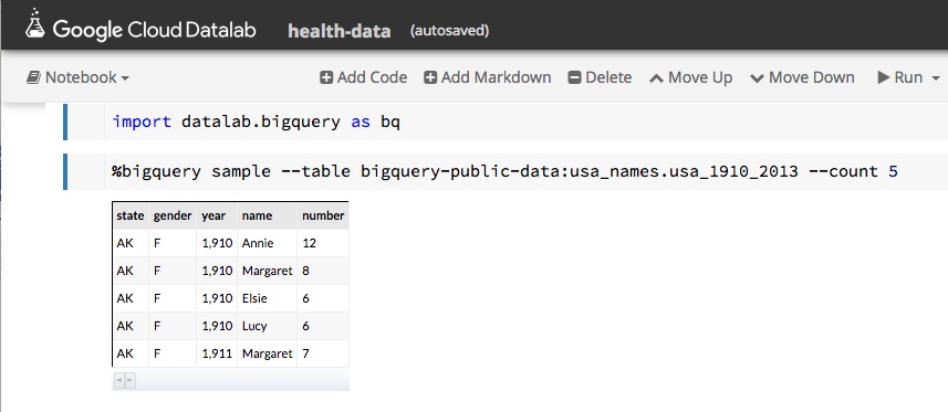
As mentioned above, one of the public data collections is the list of first names from social security registrations.   Using Datalab we can look at a sample of this data by using one of the built-in Bigquery functions as shown in Figure 2.
datalab-names

Figure 2.   Sampling the names data.


This page gives us enough information about the schema that we can now formulate a query.

In modern America there is a movement to “post-gender” names.   Typical examples cited on the web are “Dakota”, “Skyler” and  “Tatum”.   A very simple SQL query can be formulated to see how the gender breakdown for these names show up in the data.  In Datalab, we can formulate the query as shown in Figure 3.

datalab-dakotaplus2

Figure 3.   Breakdown by gender of three “post-gender” names.

As we can see, this is very nearly gender balanced.  A closer inspection using each of the three names separately show that “Skyler” tends to be ‘F’ and “Tatum” tends to ‘M’. On the other hand, “Dakota” does seem to be truly post-gender with 1052 ‘F’ and 1200 ‘M’ occurrences.

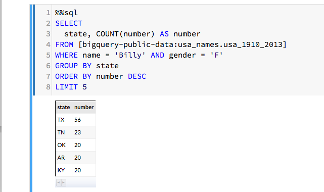
We can also consider the name “Billy” which, in the US, is almost gender neutral.   (Billy Mitchel was a famous World Work I general and also a contemporary Jazz musician.  Both male. And Billy Tipton and Billy Halliday were female musicians though Billy Halliday was actually named Billie and Billy Tipton lived her life as a man, so perhaps they don’t count.   We can ask how often Billy was used as a name associated with gender ‘F’ in the database?  It turns out it is most common in the southern US. We can then group these by state and create a count and show the top five.   The SQL command is easily inserted into the Datalab note book as shown in Figure 4.
datalab-billy

Figure 4.   Search for Billy with gender ‘F’ and count and rank by state of birth.

Rubella in Washington and Indiana

 A more interesting data collection is Center for Disease Control and Prevention dataset concerning diseases reported by state and city over a long period.   An interesting case is Rubella, which is virus also known as the “German measles”.   Through our vaccination programs it has been eliminated in the U.S. except for those people who catch it in other countries where it still exists.  But in the 1960s it was a major problem with an estimated 12 million cases in the US and a significant number of newborn deaths and birth defects.   The vaccine was introduced in 1969 and by 1975 the disease was almost gone.   The SQL script shown below is a slight modified version of one from the Google Bigquery example.   It has been modified to look for occurrences of Rubella in two states, Washington and Indiana, over the years 1970 and 1971.

%%sql --module rubella
SELECT
  *
FROM (
  SELECT
    *, MIN(z___rank) OVER (PARTITION BY cdc_reports_epi_week) AS z___min_rank
  FROM (
    SELECT
      *, RANK() OVER (PARTITION BY cdc_reports_state ORDER BY cdc_reports_epi_week ) AS z___rank
    FROM (
      SELECT
        cdc_reports.epi_week AS cdc_reports_epi_week,
        cdc_reports.state AS cdc_reports_state,
        COALESCE(CAST(SUM((FLOAT(cdc_reports.cases))) AS FLOAT),0) 
         AS cdc_reports_total_cases
      FROM
        [lookerdata:cdc.project_tycho_reports] AS cdc_reports
      WHERE
        (cdc_reports.disease = 'RUBELLA')
        AND (FLOOR(cdc_reports.epi_week/100) = 1970 
          OR FLOOR(cdc_reports.epi_week/100) = 1971)
        AND (cdc_reports.state = 'IN'
          OR cdc_reports.state = 'WA')
      GROUP EACH BY
        1, 2) ww ) aa ) xx
WHERE
  z___min_rank <= 500
LIMIT
  30000

We can now invoke this query as part of a python statement so we can capture its result as a pandas data frame and pull apart the time stamp fields and data values.

rubel = bq.Query(rubella).to_dataframe()
rubelIN = rubel[rubel['cdc_reports_state']=='IN']
                 .sort_values(by=['cdc_reports_epi_week'])
rubelWA = rubel[rubel['cdc_reports_state']=='WA']
                 .sort_values(by=['cdc_reports_epi_week'])
epiweekIN = rubelIN['cdc_reports_epi_week']
epiweekWA = rubelWA['cdc_reports_epi_week']
rubelINval = rubelIN['cdc_reports_total_cases']
rubelWAval = rubelWA['cdc_reports_total_cases']

At this point a small adjustment must be made to the time stamps.  The CDC reports times in epidemic weeks and there are 52 weeks in a year.    So the time stamps for the first week of 1970 is 197000 and the time stamp for the last week is 197051.  The next week is 197100.  To make these into timestamps that appear contiguous we need to make a small “time compression” as follows.

realweekI = np.empty([len(epiweekIN)])
realweekI[:] = epiweekIN[:]-197000
realweekI[51:] = realweekI[51:]-48

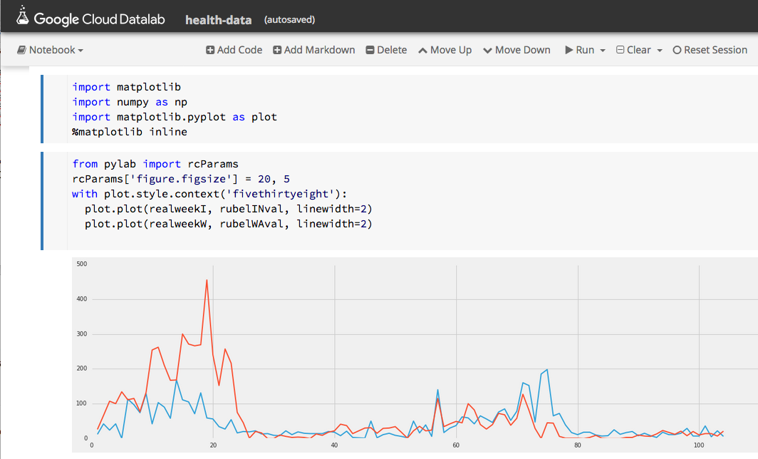
Doing the same thing with epiweekWA we now have the basis of something we can graph.  Figure 5 shows the progress of rubella in Washington and Indiana over two years.  Washington is the red line and Indiana is blue.   Note that the outbreaks occur about the same time in both states and that by late 1971 the disease is nearly gone.
datalab-rubella.png

Figure 5.   Progress of Rubella in Washington (red) and Indiana (blue) from 1970 through 1971.

Continuing the plot over 1972 and 1973 show there are flare-ups of the disease each year but their maximum size is diminishes rapidly.

(Datalab has some very nice plotting functions, but we could not figure out how to do a double plot, so we used the mathplot library with the “fivethirtheight” format.)


A Look at the Weather


From the national oceanographic and atmospheric administration we have the global summary of the day’s (GSOD) weather from the from 9000 weather stations between 1929 and 2016.   While not all of these stations were operating during that entire period, there is still a wealth of weather data here.   To illustrate it, we can use another variation on one of Google’s examples.  Let’s find the hottest spots in the state of Washington for 2015.   This was a particularly warm year that brought unusual droughts and fires to the state. The following query will list the hottest spots in the state for the year.

%%sql
SELECT
  max, (max-32)*5/9 celsius, mo, da, state, stn, name
FROM (
  SELECT
    max, mo, da, state, stn, name
  FROM
    [bigquery-public-data:noaa_gsod.gsod2015] a
  JOIN
    [bigquery-public-data:noaa_gsod.stations] b
  ON
    a.stn=b.usaf
    AND a.wban=b.wban
  WHERE
    state="WA"
    AND max

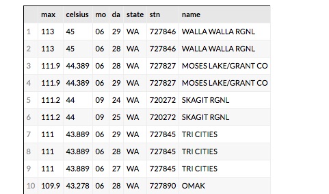
 The data set ‘gsod2015’ is the table of data for the year 2015.  To get a list that also shows the name of the station we need to do a join with the ‘station’ table over the corresponding station identifiers.  We order the results descending from the warmest recordings.    The resulting table is shown in Figure 6 for the top 10.
datalab-hotstations

Figure 6.   The top 10 hottest spots in Washington State for 2015

The results are what we would expect.   Walla Walla, Moses Lake and Tri Cities are in the eastern part of the state and summer was very hot there in 2015.   But  Skagit RGNL is in the Skagit Valley near Puget Sound.   Why is it 111 degrees F there in September?   If it is hot there what was the weather like in the nearby locations?   To find out which stations were nearby we can look at the stations on a map.   The query is simple but it took some trial and error.

%%sql --module stationsx
DEFINE QUERY locations
  SELECT FLOAT(lat/1000.0) AS lat, FLOAT(lon/1000.0) as lon, name
  FROM [bigquery-public-data:noaa_gsod.stations]
  WHERE state="WA" AND name != "SPOKANE NEXRAD"

It seems that the latitude and longitude for the Spokane NEXRAD station are incorrect and resolve to some point in Mongolia.  By removing it we get a good picture of the nearby stations as shown in Figure 7.

datalab-hotstations.png

Figure 7.   Location of weather stations in western Washington using the Bigquery chart map function.

 This is an interactive map, so we can get the names of the nearby stations.   There is one only a few miles away  called PADILLA BAY RESERVE and the next closest is BELLINGHAM INTL.   We can now compare the weather for 2015 at these three locations.

 To get the weather for each of these we need the station ID.   We can do that with a simple query.

%%sql
SELECT
  usaf, name
FROM [bigquery-public-data:noaa_gsod.stations] 
WHERE
    name="BELLINGHAM INTL" OR name="PADILLA BAY RESERVE" OR name = "SKAGIT RGNL"

Once we have our three station IDs we can use the follow to build a parameterized Bigquery expression.

qry = "SELECT max AS temperature, \
       TIMESTAMP(STRING(year) + '-' + STRING(mo) + \
       '-' + STRING(da)) AS timestamp \
FROM [bigquery-public-data:noaa_gsod.gsod2015] \
WHERE stn = '%s' and max /< 500 \
ORDER BY year DESC, mo DESC, da DESC"

stationlist = ['720272','727930', '727976']

dflist = [bq.Query(qry % station).to_dataframe() for station in stationlist]

 We can now render an image of the weather for our three stations as shown in Figure 8.

datalab-3stations-final.png

Figure  8.  Max daily temperatures for Skagit (blue), Padilla Bay (red) and Bellingham (yellow)

 We can clearly see the anomaly for Skagit in September and it is also easy to spot another problem in March where the instruments seemed to be not recording.   Other than that there is close alignment of the readings.

Conclusions

There are many features of Datalab that we have not demonstrated here.   The documentation gives an example of using Datalab with Tensorflow and the charting capabilities are more extensive than demonstrated here.  (The Google maps example here was not reproducible in any other notebook beyond the demo in the samples which we modified to run the code here.)  It is also easy to upload your own data to the warehouse and analyze it with Datalab.

 Using Datalab is almost addictive.  For every one of the data collections we demonstrated here there were many more questions we wanted to explore.  For example, where and when did the name “Dakota” start being used and how did its use spread?   Did the occurrence of Rubella outbreaks correspond to specific weather events?  Can we automate the process of detecting non-functioning weather instruments over the years where records exist?  These are all relatively standard data mining tasks, but the combination of Bigquery and IPython in the notebook format makes it fun.

 It should be noted that Datalab is certainly not the first use of the IPython notebook as a front-end to cloud hosted analysis tools.  The IPython notebook has been used frequently with Spark as we have previously described.  Those interested in an excellent overview of data science using Python should look at “Python Data Science Handbook”  by Jake VanderPlas which makes extensive use of IPython notebooks.     There are a variety of articles about using Jupyter on AWS  and Azure for data analytics.  A good one is by Cathy Ye about deep learning using Jupyter in the cloud where she gives detailed instruction for how to install Jupyter on AWS and deploy Caffe there.

.

Performance Analysis of a Cloud Microservice-based ML Classifier

(This is an edited version correcting some of the analysis in the version i posted last week)

Microservice architectures have become an important tool for large scale cloud application deployment. I wanted to understand how well a swarm of microservices could be used to process streams of events where a non-trivial computation is required for each.   I decided a fun test would be to use machine learning to classify scientific document abstract that appear on public RSS feeds.   This is the first result of that experiment.  It uses a very small Mesosphere cluster on Microsoft Azure.   I will release the code to GitHub and data as soon as i clean it up a bit.

In a previous post we looked at building a document classifier for scientific paper abstracts.   In this post we will see how we can deploy it as a network of containerized microservices running on Mesosphere on Microsoft Azure.  We will then push this network of services hard to see how well it scales and we will try to isolate the performance issues. Specifically we are interested in the following challenge. If you have a heavy stream of events coming into a stream analysis system you may overload your services.   The conventional wisdom is that you can scale up the number of servers and services to cope with the load.   Fortunately more than one microservice instance can be deployed on a single VM. But does increasing the number of services instances per VM allow us to scale the system to meet the throughput requirements? Are there fundamental limits to how well this strategy will work? What are the limiting factors?

To summarize where we are so far, we have a set of RSS feeds that are “pushing” scientific publication events to us.   Our system looks at the abstracts of these events and use several different machine learning tools to classify the document into one (or more) scientific disciplines and sub-disciplines.   We have five major disciplines: Physics, Math, Biology, Computer Science and Finance. Each of these major disciplines is further divided into a number of sub-disciplines or specialties. We have divided the work into four main activities

  1. Training the classifiers. For this we used some of the labeled data from the ArXiv RSS feeds as training data.   (This was discussed in detail in the previous post, so we won’t go over it again here.)   This training phase is used to generate models that will be used by the classifier services discussed here.   We generate models for the main topic classifier and each of the sub-domain classifiers.   This is a pre-processing step and it is not counted in our performance analysis.
  2. Pulling the events from the RSS feeds and pushing them to the main topic classifier. The main topic predictor/classifier uses two primary machine learning methods to determine which disciplines the incoming documents belongs to.   As we have seen, these two methods agree on the discipline about 87% of the time. But sometimes they disagree on a document and we have two potential correct answers.   We interpret this as a potentially “interdisciplinary” research document and classify it as belong to both answers.
  3. Doing the sub-domain classification. As shown in the Figure 1 below the major topic classifiers push the document to the one (or two) sub-discipline specific classifiers.   These classifiers use the same ML methods as the main topic classifier to further classify the document into the sub-disciplines.

architecture

Figure 1.   Conceptual model of the document classifier microservice architecture

Managing queues and Pushing the classified document to a table of results.

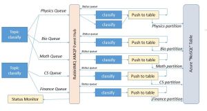
What is not shown in the diagram in Figure 1 is what happens next. While the conceptual model provides a reasonable top-level view, the real design requires several additional critical components.   First as events move through the system you need a way to buffer them in queues.   We use the Active Message Queuing Protocol (AMQP) which is one of the standards in this space.   A good implementation of AMQP is the RabbitMQ system which we hosted on a server in the Azure cloud.     As shown in Figure 2   we (logically) position the RabbitMQ event hub between the major topic classifiers and the sub-domain classifiers.   We establish 7 queues on the event hub.   There is a queue for each of the major topic areas (Physics, Bio, Math, CS, and Finance), a “status” queue and a “role” queue.   The classify microservices are given classification roles by polling the “role” queue.   This tells them which topic area they are assigned to.   When they complete the sub-domain classification of a document they invoke another microservice that is responsible for storing the result in the appropriate table partition for later lookup by the users. This microservice sends an acknowledgement of the completed classification back to the event “status” queue prior. We shall refer to this microservice as the Table Web Service.  The “Status Monitor” is the overall system log and is critical for our performance measurements.

arch-detail

Figure 2.   The detailed architecture picture.

The Execution Environment

The RabbitMQ server is hosted on a Linux VM on Microsoft Azure and the rest of the system is deployed on a small Mesosphere cluster in a different Azure data center (see Figure 3).   The cluster is indeed small. There is one master node that runs the Mesosphere life cycle management services, the web browser interface and Marathon job management service. There are 5 dual core worker VMs. The Azure table is also a separate service.   The experiment status monitor runs in an IPython Notebook on my laptop.  experiment-setup

Figure 3.  Execution Environment

Using the web interface for Marathon we deploy different service configurations for the experiments described here.   Our table-pusher web service listens on a fixed port, so we can only have one instance per worker VM.   In practice this works out reasonably well because the classify services on any VM can invoke the local copy with very little overhead.   However, as we shall see, there are other major overheads associated with this service that will play a large role in the performance analysis.

We are not limited by the number of classify services we deploy.   If the system operator wants 20 “physics” sub-domain classifiers, the operator need only increase the deployment size of the classifier service by 20 and then submit 20 “physics” role messages into the role queue.

The Microservice Life Cycles

The top-level topic classifiers take the data from the RSS streams and apply the machine learning algorithms to produce the best 1 (or 2) potential topics.   The result is converted to a json object which contains

  1. The domain as determined by the random forest classifier we call RF
  2. The domain as determined by a hybrid classifier we call “the best of 3 classifier” (see the previous post) we call Best.
  3. The title of the document
  4. The body (abstract) of the document.

This doc json object is then pushed into the queue specified by the ML classifiers. If both RF and Best agree on a topic like “math” then the document is put in the “math” queue.   If they disagree and one says “math” and the other says “bio” then the document is placed in both the “math” and “bio” queues.    The classifier microservice has the following life-cycle.

ML Classifier

  1. When launched it opens a connection to the “roles” queue and wait for a topic.
  2. When it receives the topic message from the “role” queue the classifier service, must initialize all the ML models for that topic from the saved trained models. (The models have been previously trained as described in the previous post and the trained models have been “pickled” and saved as blob in Azure blob storage.)
  3. It then begins to scan the queue for that topic.   It pulls the json document objects from the queue and applies the classifier. It then packages up a new json object consisting of the main topic, new sub-classification, title and abstract. For example, if the item came from the “physics” queue and the classifier decides it in the subclass “General Relativity”, then that is the sub-classification that in the object. (The classifier also has a crude confidence estimator. If it is not very certain the sub-classification is “General Relativity?”.   If it is very uncertain and General Relativity is the best of the bad choices, then it is “General Relativity???”.) It then sends this object via a web service call to a local web service (described below) that is responsible for putting the object into an Azure table. (more on this step below. )
  4. The service repeats 3 until it receives a “reset” message in the topic queue.   It then returns to the roles queue and step 1.

Table Web Service

(note: this is a revised version.   the reliable and fast versions were incorrectly described in the  previous version of this post.)

The table web service is the microservice component that receives web service invocations from the classifier. Staying true to the Microservice design concept it has only one job.

  1. When Invoked it pulls the json object from the invocation payload and formats a Table service tuple to insert into the partition of the table associated with the main topic.
  2. We actually have three versions of web service one we call “fast” and the other “reliable” and the other is “null”.
    • The “reliable” version works by making a new connection to the RabbitMQ event server and then opens a channel to send it messages.  It then inserts the tuple in  table and then sends a time stamped status notification to  the event queue.
    • The “fast” version reuses the RabbitMQ connection for as long as possible. For each invocation it opens the channel and inserts the message.
    • The “null” version skips the Azure table entirely and is used only for the performance evaluation.

(Unfortunately, the RabbitMQ connection will timeout if there is a lull in the use and catching the timeout connection and restarting it proved to be problematic.   So the “fast” version is only used to illustrate the performance models below. It is not reliable. The “reliable” version is very reliable.   It runs for months at a time without problems. As we shall see, it is slower.  The “null” version is fast and reliable but not actually useful for anything other than benchmarks.)

  1. Before returning a web service response to the calling classifier instance the web-service sends a time-stamped message to status queue.

The Experiment

It was stated at the outset of this document that we are interested in understanding the effect of scaling the number Docker containers on the ability of the system to meet the flow of events into the system. To test the system under load we pre-loaded 200 abstract for the Biology topic into the message queue and all the classifier service instances were instructed to be Biology sub-topic classifiers.   We then ran this with 1, 2, 4, 8, 16 and 24 instances of the classifier microservice.   We ran this against all three versions of the table web service.   To compute the elapsed time to consume and process all 200 abstracts the table web service appended a timestamp to each status message. By looking at the time stamp for the first message and the last message we could determine the system throughput. (There were five different worker VMs so there is a small issue of clock skew between timestamps, but this was negligible.   What was not negligible was delays cause by network traffic between the data centers.   Hence I would estimate that the error bars for all the number below to be about 10%. We ran many tests and the number below are averages.

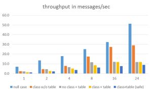
The most important number is the throughput of the system in classifications per second.   The table in Figure 4 summarizes the results.   Clearly the best throughput was obtained with the combination of the null classifier and the null table service.   The next best was the combination of the classifier and the null table service.

throughput

Figure 4. Throughput results for 1, 2, 4, 8, 16 and 24 instances of the classifier service.

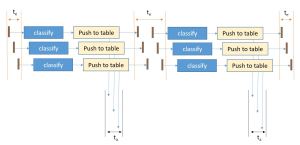
The combination of the classifier and either the fast or reliable table service showed rather poor performance.   To understand this we need to look at the basic flow of execution of a single classifier and a single table web service as shown in Figure 5.   Note that the classifier that invokes the web service cannot return to fetch another task until the table web service has sent the status message.

classify-thread

Figure 5. Flow of control of the classify-table web service from the message queue and back.

To understand where congestion may exist look at the points where resource contention may occur when multiple classify instances are running.   This is illustrated in Figure 6.

classify-pipeline

Figure 6.   The major points of resource contention occur when the services access the Azure Table service and the RabbitMQ message broker.

Quantifying this let

eq1 - Copy

We can do a very crude speedup analysis based on Amdahl’s law.   Looking at the part of the computation that is purely parallel and assuming sequential access to the Table service and message broker we can say

eq2 - Copy

tseq is a function of the two points of contention.   It turns out that the message queue is fast in comparison to the Azure table service.   This is due to the complexity of inserting an item into a table. Because we are only using one table partition “Biology” all our inserts go into one place.   Unfortunately, inserts into any disk-based system are going to involve locks so this is not surprising.  However, the difference between the fast version and the reliable version illustrate the high cost of establishing a new connection to the message broker for each event.  I am not sure what the function “f” is above but i suspect it is additive.

Let Tserial be the time for one instance of the classify service to complete the execution the set of messages and Tpar (n) be the time it takes n instances to do the job. We then have

eq3 - Copy

The speedup of n classifiers over a single classifier is then

eq4 - Copy

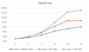
Analysis of the data on the time to do a single classifier with no table service give us tpar = 450 ms (approximately) and tseq  = 60 ms for the fast service and 100 ms for the reliable service.   Using the formula above we have the maximum speed-up Smax   = 8.5 for the fast service an 5.5 for the reliable service.   This approximately agrees with the results we can measure as seen in figure 7 below.

speedup

Figure 7.   Speed-up relative to one instance of the classifier with different table services plotted against different numbers of classifier instances.

Of course speed-up is a relative number, but it does illustrate the way systems scale.   As we can see the limits are approximately what we predicted.   However the case of the null table is different.   There should be essentially no sequential component so why is it flat-lining at around 13? The answer is that there are only 10 cores in our system.   That puts a fundamental limit on the performance.   In fact we are lucky to get more than a speed-up of 10.

Conclusions

One thing that does not come out in the text above is how well the concept of microservices worked.   One of the major selling points for this style of application construction is that factoring of the services into small independent components can help with maintenance of the overall system.   Using Mesosphere and the Marathon task scheduled proved this point well.   It was possible to modify, remove and scale any of the services without having to bring down the others.   This made all of the experiment described above easy to carry out.   And the system remained up for several months.

It is clear that 10 cores is not a very impressive platform to test scalability.   We did demonstrate that we could easily scale to about 2.5 services per core without problems.   Going beyond that did not improve performance.   I am currently trying to build an instance of Mesosphere or other Docker cluster mechanism (perhaps Swarm) with at least 100 servers.   I will update these results when i have that complete.

Another thing to do is cache the table writes and then update the table with an entire block.   A good solution for this is to introduce a Redis cache service.   Fortunately Docker makes this trivial.   Redis containers are  in the library.  Doing this and having a much larger cluster should enable at least a 20x improvement.

Actually, a more interesting experiment is to try this classification problem using one of the more conventional tools that already exist.   For example Microsoft Stream Analytics + Azure Machine Learning & Microsoft StreamInsight, Spark Streaming + Event Hubs and HDInsight, Amazon Kinesis, Google BigQuery, IBM Watson Analytics and numerous open source IoT platforms.   I plan to start with the Azure solution while i still have Azure resources.

I am in the process of moving all the code and data for this experiment into GitHub.   I will post link to these items in the next week or so.