Tag Archives: python

A Brief Look at Google’s Cloud Datalab

Google recently released a beta version of a new tool for data analysis using the cloud called Datalab.  In the following paragraphs we take a brief look at it through some very simple examples.  While there are many nice features of Datalab, the easiest way to describe it would be to say that it is a nice integration of the IPython Jupyter notebook system with Google’s BigQuery data warehouse.  It also integrates standard IPython libraries such as graphics and scikit-learn and Google’s own machine learning toolkit TensorFlow.

To use it you will need a Google cloud account.   The free account is sufficient if you are interested in just trying it out.   You may ask, why do I need a Google account when I can use Jupyter, IPython and TensorFlow on my own resources?    The answer is you can easily access BigQuery on non-trivial sized data collections directly from the notebook running on your laptop.  To get started go to the Datalab home page.   It will tell you that this is a beta version and give you two choices: you may either install the Datalab package locally on your machine or you may install it on a VM in the Google cloud.   We prefer the local version because it saves your notebooks locally.

 The Google public data sets that are hosted in the BigQuery warehouse are fun to explore.  They include

  • The names on all US social security cards for births after 1879.  (The table rows contain only the year of birth, state, first name, gender and number as long as it is greater than 5.  No social security numbers.),
  • The New York City Taxi trips from 2009 to 2015,
  • All stories and comments from “Hacker News”,
  • The US Dept of Health weekly records of diseases reported from each city and state from 1888 to 2013,
  • The public data from the HathiTrust and the Internet Book Archive,
  • The global summary of the day’s (GSOD) weather from the national oceanographic and atmospheric administration from 9000 weather stations between 1929 and 2016.

And more, including the 1000 genome database.

To run Datalab on your laptop you need to have Docker installed.   Once Docker is running then and you have created a Google cloud account and created a project, you can launch Datalab with simple docker command as illustrated in their quick-start guide.  When the container is up and running you can view it at http://localhost:8081.  What you see at first is shown in Figure 1.  Keep in mind that this is beta release software so you can expect it will change or go away completely. 

 datalab-first-view

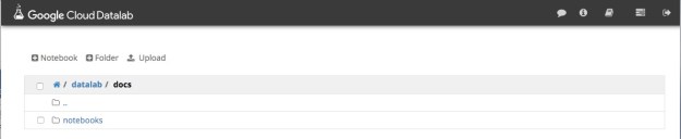
Figure 1.  Datalab Top level view.

Notice the icon in the upper right corner consisting of a box with an arrow.   Clicking this allows you to login to the Google cloud and effectively giving your authorization to allow you container to run on your gcloud account.

The view you see is the initial notebook hierarchy.   Inside docs is a directory called notebooks that contain many great tutorials and samples.

A Few Simple Examples of Using Datalab

As mentioned above, one of the public data collections is the list of first names from social security registrations.   Using Datalab we can look at a sample of this data by using one of the built-in Bigquery functions as shown in Figure 2.

datalab-names

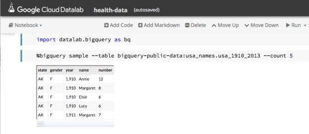
Figure 2.   Sampling the names data.


This page gives us enough information about the schema that we can now formulate a query.

In modern America there is a movement to “post-gender” names.   Typical examples cited on the web are “Dakota”, “Skyler” and  “Tatum”.   A very simple SQL query can be formulated to see how the gender breakdown for these names show up in the data.  In Datalab, we can formulate the query as shown in Figure 3.

datalab-dakotaplus2

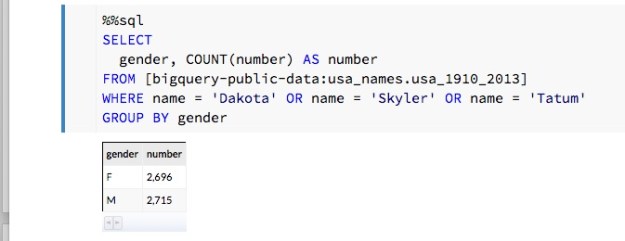
Figure 3.   Breakdown by gender of three “post-gender” names.

As we can see, this is very nearly gender balanced.  A closer inspection using each of the three names separately show that “Skyler” tends to be ‘F’ and “Tatum” tends to ‘M’. On the other hand, “Dakota” does seem to be truly post-gender with 1052 ‘F’ and 1200 ‘M’ occurrences.

We can also consider the name “Billy” which, in the US, is almost gender neutral.   (Billy Mitchel was a famous World Work I general and also a contemporary Jazz musician.  Both male. And Billy Tipton and Billy Halliday were female musicians though Billy Halliday was actually named Billie and Billy Tipton lived her life as a man, so perhaps they don’t count.   We can ask how often Billy was used as a name associated with gender ‘F’ in the database?  It turns out it is most common in the southern US. We can then group these by state and create a count and show the top five.   The SQL command is easily inserted into the Datalab note book as shown in Figure 4.

datalab-billy

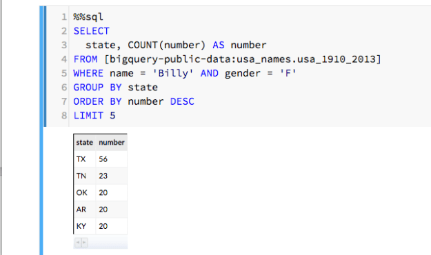
Figure 4.   Search for Billy with gender ‘F’ and count and rank by state of birth.

Rubella in Washington and Indiana

 A more interesting data collection is Center for Disease Control and Prevention dataset concerning diseases reported by state and city over a long period.   An interesting case is Rubella, which is virus also known as the “German measles”.   Through our vaccination programs it has been eliminated in the U.S. except for those people who catch it in other countries where it still exists.  But in the 1960s it was a major problem with an estimated 12 million cases in the US and a significant number of newborn deaths and birth defects.   The vaccine was introduced in 1969 and by 1975 the disease was almost gone.   The SQL script shown below is a slight modified version of one from the Google Bigquery example.   It has been modified to look for occurrences of Rubella in two states, Washington and Indiana, over the years 1970 and 1971.

%%sql --module rubella
SELECT
  *
FROM (
  SELECT
    *, MIN(z___rank) OVER (PARTITION BY cdc_reports_epi_week) AS z___min_rank
  FROM (
    SELECT
      *, RANK() OVER (PARTITION BY cdc_reports_state ORDER BY cdc_reports_epi_week ) AS z___rank
    FROM (
      SELECT
        cdc_reports.epi_week AS cdc_reports_epi_week,
        cdc_reports.state AS cdc_reports_state,
        COALESCE(CAST(SUM((FLOAT(cdc_reports.cases))) AS FLOAT),0) 
         AS cdc_reports_total_cases
      FROM
        [lookerdata:cdc.project_tycho_reports] AS cdc_reports
      WHERE
        (cdc_reports.disease = 'RUBELLA')
        AND (FLOOR(cdc_reports.epi_week/100) = 1970 
          OR FLOOR(cdc_reports.epi_week/100) = 1971)
        AND (cdc_reports.state = 'IN'
          OR cdc_reports.state = 'WA')
      GROUP EACH BY
        1, 2) ww ) aa ) xx
WHERE
  z___min_rank <= 500
LIMIT
  30000

We can now invoke this query as part of a python statement so we can capture its result as a pandas data frame and pull apart the time stamp fields and data values.

rubel = bq.Query(rubella).to_dataframe()
rubelIN = rubel[rubel['cdc_reports_state']=='IN']
                 .sort_values(by=['cdc_reports_epi_week'])
rubelWA = rubel[rubel['cdc_reports_state']=='WA']
                 .sort_values(by=['cdc_reports_epi_week'])
epiweekIN = rubelIN['cdc_reports_epi_week']
epiweekWA = rubelWA['cdc_reports_epi_week']
rubelINval = rubelIN['cdc_reports_total_cases']
rubelWAval = rubelWA['cdc_reports_total_cases']

At this point a small adjustment must be made to the time stamps.  The CDC reports times in epidemic weeks and there are 52 weeks in a year.    So the time stamps for the first week of 1970 is 197000 and the time stamp for the last week is 197051.  The next week is 197100.  To make these into timestamps that appear contiguous we need to make a small “time compression” as follows.

realweekI = np.empty([len(epiweekIN)])
realweekI[:] = epiweekIN[:]-197000
realweekI[51:] = realweekI[51:]-48

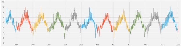
Doing the same thing with epiweekWA we now have the basis of something we can graph.  Figure 5 shows the progress of rubella in Washington and Indiana over two years.  Washington is the red line and Indiana is blue.   Note that the outbreaks occur about the same time in both states and that by late 1971 the disease is nearly gone.

datalab-rubella.png

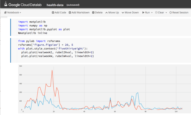
Figure 5.   Progress of Rubella in Washington (red) and Indiana (blue) from 1970 through 1971.

Continuing the plot over 1972 and 1973 show there are flare-ups of the disease each year but their maximum size is diminishes rapidly.

(Datalab has some very nice plotting functions, but we could not figure out how to do a double plot, so we used the mathplot library with the “fivethirtheight” format.)


A Look at the Weather


From the national oceanographic and atmospheric administration we have the global summary of the day’s (GSOD) weather from the from 9000 weather stations between 1929 and 2016.   While not all of these stations were operating during that entire period, there is still a wealth of weather data here.   To illustrate it, we can use another variation on one of Google’s examples.  Let’s find the hottest spots in the state of Washington for 2015.   This was a particularly warm year that brought unusual droughts and fires to the state. The following query will list the hottest spots in the state for the year.

%%sql
SELECT
  max, (max-32)*5/9 celsius, mo, da, state, stn, name
FROM (
  SELECT
    max, mo, da, state, stn, name
  FROM
    [bigquery-public-data:noaa_gsod.gsod2015] a
  JOIN
    [bigquery-public-data:noaa_gsod.stations] b
  ON
    a.stn=b.usaf
    AND a.wban=b.wban
  WHERE
    state="WA"
    AND max

 The data set ‘gsod2015’ is the table of data for the year 2015.  To get a list that also shows the name of the station we need to do a join with the ‘station’ table over the corresponding station identifiers.  We order the results descending from the warmest recordings.    The resulting table is shown in Figure 6 for the top 10.

datalab-hotstations

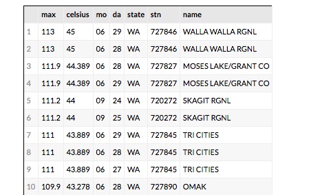
Figure 6.   The top 10 hottest spots in Washington State for 2015

The results are what we would expect.   Walla Walla, Moses Lake and Tri Cities are in the eastern part of the state and summer was very hot there in 2015.   But  Skagit RGNL is in the Skagit Valley near Puget Sound.   Why is it 111 degrees F there in September?   If it is hot there what was the weather like in the nearby locations?   To find out which stations were nearby we can look at the stations on a map.   The query is simple but it took some trial and error.

%%sql --module stationsx
DEFINE QUERY locations
  SELECT FLOAT(lat/1000.0) AS lat, FLOAT(lon/1000.0) as lon, name
  FROM [bigquery-public-data:noaa_gsod.stations]
  WHERE state="WA" AND name != "SPOKANE NEXRAD"

It seems that the latitude and longitude for the Spokane NEXRAD station are incorrect and resolve to some point in Mongolia.  By removing it we get a good picture of the nearby stations as shown in Figure 7.

datalab-hotstations.png

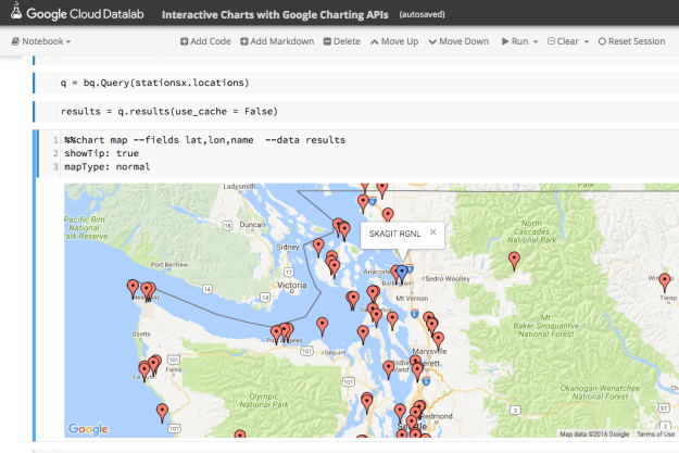
Figure 7.   Location of weather stations in western Washington using the Bigquery chart map function.

 This is an interactive map, so we can get the names of the nearby stations.   There is one only a few miles away  called PADILLA BAY RESERVE and the next closest is BELLINGHAM INTL.   We can now compare the weather for 2015 at these three locations.

 To get the weather for each of these we need the station ID.   We can do that with a simple query.

%%sql
SELECT
  usaf, name
FROM [bigquery-public-data:noaa_gsod.stations] 
WHERE
    name="BELLINGHAM INTL" OR name="PADILLA BAY RESERVE" OR name = "SKAGIT RGNL"

Once we have our three station IDs we can use the follow to build a parameterized Bigquery expression.

qry = "SELECT max AS temperature, \
       TIMESTAMP(STRING(year) + '-' + STRING(mo) + \
       '-' + STRING(da)) AS timestamp \
FROM [bigquery-public-data:noaa_gsod.gsod2015] \
WHERE stn = '%s' and max /< 500 \
ORDER BY year DESC, mo DESC, da DESC"

stationlist = ['720272','727930', '727976']

dflist = [bq.Query(qry % station).to_dataframe() for station in stationlist]

 We can now render an image of the weather for our three stations as shown in Figure 8.

datalab-3stations-final.png

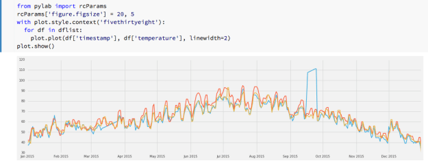
Figure  8.  Max daily temperatures for Skagit (blue), Padilla Bay (red) and Bellingham (yellow)

 We can clearly see the anomaly for Skagit in September and it is also easy to spot another problem in March where the instruments seemed to be not recording.   Other than that there is close alignment of the readings.

Conclusions

There are many features of Datalab that we have not demonstrated here.   The documentation gives an example of using Datalab with Tensorflow and the charting capabilities are more extensive than demonstrated here.  (The Google maps example here was not reproducible in any other notebook beyond the demo in the samples which we modified to run the code here.)  It is also easy to upload your own data to the warehouse and analyze it with Datalab.

 Using Datalab is almost addictive.  For every one of the data collections we demonstrated here there were many more questions we wanted to explore.  For example, where and when did the name “Dakota” start being used and how did its use spread?   Did the occurrence of Rubella outbreaks correspond to specific weather events?  Can we automate the process of detecting non-functioning weather instruments over the years where records exist?  These are all relatively standard data mining tasks, but the combination of Bigquery and IPython in the notebook format makes it fun.

 It should be noted that Datalab is certainly not the first use of the IPython notebook as a front-end to cloud hosted analysis tools.  The IPython notebook has been used frequently with Spark as we have previously described.  Those interested in an excellent overview of data science using Python should look at “Python Data Science Handbook”  by Jake VanderPlas which makes extensive use of IPython notebooks.     There are a variety of articles about using Jupyter on AWS  and Azure for data analytics.  A good one is by Cathy Ye about deep learning using Jupyter in the cloud where she gives detailed instruction for how to install Jupyter on AWS and deploy Caffe there.

.

An Encounter with Google’s TensorFlow

NOTE: This is a revised version of this blog that reflects much better ways to do some of the tensor algebra in the first example below.

Google has recently released some very interesting new tools to the open source community.   First came Kubernetes, their container microservice framework, and that was followed by two new programming systems based on dataflow concepts.   Dataflow is a very old idea that first appeared in the computer architecture community in the 1970 and 80s.   Dataflow was created as an alternative to the classical von-Neumann computer design.  It was hoped that it would have a performance advantage because it would exploit much greater levels of parallelism than thought possible with classical computers[1].  In dataflow systems computation can be visualized as a directed graph where the vertices of the graph are operators and data “flows” through the system along the edges of the graph.  As soon as data is available on all the input edges of an operator node the operation is carried out and new data is put on the output edges of the node.  While only a few actual data flow computers were built, the concept has been fundamental to distributed and parallel computing for a long time.  It shows up in applications like complex event processing, stream analytics and systems like the Microsoft AzureML programming model I described earlier.

Google’s newly released Cloud Dataflow is a programming system for scalable stream and batch computing.  I will return to Cloud Dataflow in another post, but for now, I will focus on the other dataflow system they released.  Called TensorFlow, it is a programming system designed to help researchers build deep neural networks[2] and it appears to be unrelated to Cloud Dataflow.  All the documentation and downloadable code for TensorFlow are on-line.  TensorFlow is also similar to Microsoft Research’s Computational Network Toolkit (CNTK) in several ways that I will describe later.

TensorFlow is designed allow the programmer to easily “script” a dataflow computation where the basic units of computing are very large multi-dimensional arrays.   The scripts are written in Python or C++ and it works very well with IPython/jupyter notebooks.   In the following pages I will give a very light introduction to TensorFlow programming and illustrate it by building a bare-bones k-means clustering algorithm.   I will also briefly describe one of their examples of a convolutional neural network.

TensorFlow can be installed and run on your laptop, but as we shall show below, it really shines on bigger more powerful hardware.  An interesting thing happened in the recent evolution of deep neural networks.   The most impressive early work on really large deep neural network was done on large cloud-scale clusters.  However, the type of parallelism needed for doing deep network computation was really very large array math, which is really better suited to execution on a GPU.  Or a bunch of GPUs on a massive memory machine or a cluster of massive memory machines with a bunch of GPUs each.  For example, the Microsoft CNTK has achieved some remarkable results on 8 GPU systems and it will soon be available on the Azure GPU Lab. (I also suspect that supercomputers such as the SDSC Comet with large memory, multi-GPU, multi-core nodes would be ideal.)

TensorFlow: a shallow introduction.

There is a really nice white paper by the folks at Google Research with far more details about the TensorFlow system architecture than I give here.  What follows is a shallow introduction and an experiment.

There are two main concepts in TensorFlow.   The first is the idea of computing on objects that are very large multi-dimensional arrays called tensors.   The second is the fact that the computation you build with tensors are compiled into graphs that are executed in a “dataflow” style.   We need to unpack both of these concepts.

Tensors

Let’s start with tensors.  First, these are not your great-great grandfather’s tensors.   Those tensors were introduced by Carl Friedrich Gauss for differential geometry where they were needed to provide metrics that could be used to describe things like the curvature of surfaces.  Einstein “popularized” tensors in his general theory of relativity.  Those tensors have a very formal algebra of covariant and contravariant forms. Fortunately, we don’t have to go there to understand the use of tensors in TensorFlow’s machine learning applications.   In fact, if you understand Numpy arrays you are off to a good start and Numpy arrays are just really efficient multidimensional arrays.   TensorFlow can be programmed in Python or C++ and I will use the Python binding in the discussion below

In TensorFlow tensors are created and stored in container objects that are one of three types: variables, placeholders and constants.   Let’s start with constants.  As the name implies constant tensors are initialized once and never changed.   Here are two different ways to create constant arrays that we will use in an example below.  One is a tensor of size Nx2 filled with zeros and the other is a tensor of the same shape filled with the value 1.

import numpy as np
import tensorflow as tf
N = 10000
X = np.zeros(shape=(N,2))
Xv = tf.constant(X, name="points")
dones = tf.fill([N,2], np.float64(1.))

We have used a Numpy array of values to create the TensorFlow constant. Notice that we have given our tensor a “name”. Naming tensors is optional but it comes in very handy when debugging.
Variables are holders of multidimensional arrays that persist across sessions and may be modified and even saved to disk. The concept of a “session” is important in TensorFlow. You can think of it as a context where actual TensorFlow calculations take place. The first calculation involving a variable is to load it with initial values. For example, let’s create a 2 by 3 tensor that, when initialized contains the constant 1.0 in every element. Then let’s convert that back to a Numpy array and print it. To do that we need a session and we will call the variable initializer in that session. When working in the IPython notebook it is easiest to use an “InteractiveSession” so that we can easily edit and redo computations.

sess = tf.InteractiveSession()
myarray = tf.Variable(tf.constant(1.0, shape = [2,3]))
init =tf.initialize_all_variables()
sess.run(init)
mynumpy =myarray.eval()
print(mynumpy)
[[ 1.  1.  1.]
 [ 1.  1.  1.]]

As shown above, the standard way to initialize variables is to initialize them all at once. The process of converting a tensor back to a Numpy array requires evaluating the tensor with the “eval” method. As we shall see this is an important operator that we will describe in more detail below.

The final tensor container is a “placeholder”.   Creating a placeholder object only requires specifying a type and some information about its shape.   We don’t initialize a placeholder like a variable because it’s initial values will be provided later in an eval()-like operation.  Here is a placeholder we will use later.

x = tf.placeholder(tf.float32, [None, 784], name="x")

Notice that in this case the placeholder x is two dimensional but the first dimension is left unbound.  This allows us to supply it with a value that is any number of rows of vectors of length 784.   As we shall see, this turns out to be very handy for training neural nets.

Dataflow

The real magic of TensorFlow is in the dataflow execution of computations.   A critical idea behind TensorFlow is to keep the slow world of Python away from the fast world of parallel tensor algebra as much as possible.  Python is used only to describe the dataflow graph of the computation.   TensorFlow has a large library of very useful tensor operators.   Let’s describe a computation we will use in the k-means example.   Suppose we have 8 points in the plane in a vector called Xv and 4 special points in an array called kPoints.   I would like to label each of the 8 points with the index of the special point nearest to it.   This should give me 4 clusters of points.   I now want to find the centroid of each of these clusters.  Assume we have a tensor called “blocked” where row i gives the distance from each of our 8 points to the ith special point.  For example, if “blocked” is as shown below then what we are looking for is the index of the smallest element in each column.tensor-table

To find the centroids I use this min index vector to select the elements of Xv in each cluster. We just add them up to and divide by the number of points in that cluster.    The TensorFlow code to do this is shown below.  TensorFlow has a large and handy library of tensor operators many of which are similar to Numpy counterparts.   For example, argmin computes the index of the smallest element in an array given the dimension over which to search.   Unsorted_segment_sum will compute a sum using another vector to define the segments.   The min index vector nicely partitions the Xv vector into the appropriate “segments” for the unsorted_segment_sum to work.  The same unsorted_segment_sum operator can be used to count the number of elements in each cluster by adding up 1s.

mins = tf.argmin(blocked, 0, name="mins")
sums = tf.unsorted_segment_sum(Xv, mins, 4)
totals = tf.unsorted_segment_sum(dones, mins, 4, name="sums")
centroids = tf.div(sums, totals, name = "newcents")

The key idea is this.  When this python code is executed it builds a data flow graph with three inputs (blocked, Xv, dones) and outputs a tensor called centroids as shown below[3].[4]

The computation does not start until we attempt to evaluate the result with a call to centroids.eval(). This sort of lazy evaluation means that we can string together as many tensor operators as needed that will all be executed outside the Python REPL.

tensor-graph1

Figure 1.  Computational flow graph

TensorFlow has a very sophisticated implementation.  The computing environment upon which it is running is a collection of computational devices.  These devices may be cpu cores, GPUs or other processing engines.   The TensorFlow compilation and runtime system maps subgraphs of the flow graph to these devises and manages the communication of tensor values between the devices.  The communication may be through shared memory buffers or send-receive message pairs inserted in the graph at strategically located points.   Just as the dataflow computer architects learned, dataflow by itself is not always efficient.  Sometimes control flow is needed to simplify execution.  The TensorFlow system also inserts needed control flow edges as part of its optimizations.   As was noted above, this dataflow style of computation is also at the heart of CNTK.   Another very important property of these dataflow graphs is that it is relatively easy to automatically compute derivatives by using the chain-rule working backwards through the graph.   This makes it possible to automate the construction of gradients that are important for finding optimal parameters for learning algorithms.   I won’t get into this here but it is very important.

A TensorFlow K-means clustering algorithm

With the kernel above we now have the basis for a simple k-means clustering algorithm shown in the code below.  Our initial centroid array is a 4 by 2 Numpy array we shall call kPoints.   What is missing is the construction of the distance array blocked.   Xv holds all the N points as a constant tensor.   My original version of this program used python code to construct blocked.  But there is an excellent improvement on computation of “mins” published in GitHub by Shawn Simister at.  Shawn’s version is better documented and about 20% faster when N is in the millions.  Simister’s computation does not need my blocked array and instead expands the Xv and centroids vector and used a reduction to get the distances.  Very nice (This is the revision to the blog post that I referred to above.)

N = 10000000
k = 4
#X is a numpy array initialized with N (x,y) points in the plane
Xv = tf.constant(X, name="points")
kPoints = [[2., 1.], [0., 2.], [-1., 0], [0, -1.]]
dones = tf.fill([N,2], np.float64(1.))

centroids = tf.Variable(kPoints, name="centroids")
oldcents = tf.Variable(kPoints)
initvals = tf.constant(kPoints, tf.float64)

for i in range(20):
    oldcents = centroids
    #This is the Simister mins computation
    expanded_vectors = tf.expand_dims(Xv, 0)
    expanded_centroids = tf.expand_dims(centroids, 1)
    distances = tf.reduce_sum( tf.square(
               tf.sub(expanded_vectors, expanded_centroids)), 2)
    mins = tf.argmin(distances, 0)
    #compute the new centroids as the mean of the points nearest
    sums = tf.unsorted_segment_sum(Xv, mins, k)
    totals = tf.unsorted_segment_sum(dones, mins, k, name="sums")
    centroids = tf.div(sums, totals, name = "newcents")
    #compute the distance the centroids have moved sense the last iteration
    dist = centroids-oldcents
    sqdist = tf.reduce_mean(dist*dist, name="accuracy")
    print np.sqrt(sqdist.eval())
    kPoints = centroids.eval()

However, this version is still very inefficient.  Notice that we construct a new execution graph for each iteration.   A better solution is to pull the graph construction out of the loop and construct it once and reuse it.   This is nicely illustrated in Simister’s version of K-means illustrated on his Github site.

It is worth asking how fast Tensor flow is compared with a standard Numpy version of the same algorithm. Unfortunately, I do not have a big machine with fancy GPUs, but I do have a virtual machine in the cloud with 16 processors. I wrote a version using Numpy and executed them both from an IPython notebook. The speed-up results are in Figure 2. Comparing these we see that simple Python Numpy is faster than TensorFlow for values of N less than about 20,000. But for very large N we see that TensorFlow can make excellent use of the extra cores available and exploits the parallelism in the tensor operators very well.

kmeans-speed

Figure 2. speed-up of TensorFlow on 16 cores over a simple Numpy implementation. The axis is log10(N)

I have placed the source for this notebook in Github. Also an improved version based on Simister’s formulation can be found there.

TensorFlow also has a very interesting web tool call TensorBoard that lets you look at various aspects of the logs of your execution. One of the more interesting TensorBoard displays is the dataflow graph for your computation. Figure 3 below shows the display generated for the k-means computational graph.

tensorboard

Figure 3.   TensorBoard graph displace of the k-means algorithm.

As previously mentioned this is far more complex than my diagram in Figure 1.   Without magnification this is almost impossible to read.  Figure 4 contains a close-up of the top of the graph where the variable newcents is created.   Because this is an iteration the dataflow actually contains multiple instances and by clicking on the bubble for the variable it will show you details as shown in the close-up.

tensorboard3

Figure 4.   A close-up of part of the graph showing expanded view of the multiple instances of the computation of the variable newcents.

A brief look at a neural network example

The k-means example above is really just an exercise in tensor gymnastics. TensorFlow is really about building and training neural networks.   The TensorFlow documents have a number of great example, but to give you the basic idea I’ll give you a brief look at their convolutional deep net for the MNIST handwritten digit example.   I’ll try to keep this short because I will not be adding much new here. The example is the well-known “hello world” world of machine learning image recognition.   The setup is as follows.   You have thousands of 28 by 28 black and white images of hand written digits and the job of the system you build is to identify each.   The TensorFlow example uses a two-layer convolutional neural net followed by a large, densely connected layer and a readout layer.

If you are not familiar with convolutional neural nets, here is the basic idea.   Images are strings of bits but they also have a lot of local 2d structure such as edges or holes or other patterns.  What we are going to do is look at 5×5 windows to try to “find” these patterns.  To do this we will train the system to build a 5×5 template W array (and a scalar offset b) that will reduce each 5×5 window to a point in a new array conv by the formula

conv-formula

(the image is padded near the boundary points in the formula above so none of the indices are out of bounds)

We next modify the conv array by applying the “ReLU” function max(0,x) to each x in the conv array so it has no negative values.   The final step is to do “max pooling”.  This step simply computes the maximum value in a 2×2 block and assigns it to a smaller 14×14 array.   The most interesting part of the convolutional network is the fact that we do not use one 5×5 template but 32 of them in parallel producing 32 14×14 result “images” as illustrated in Figure 5 below.convolutional

Figure 5.   The first layer convolutional network.

When the network is fully trained each of the 32 5×5 templates in W is somehow different and each selects for a different set of features in the original image. One can think of the resulting stack of 32 14×14 arrays (called h_pool1) as a type of transform of the original image much as a Fourier transform can separate a signal in space and time and transform it into frequency space. This is not what is going on here but I find the analogy helpful.
We next apply a second convolutional layer to the h_pool1 tensor but this time we apply 64 sets of 5×5 filters to each the 32 h_pool1 layers (and adding up the results) to give us 64 new 14×14 arrays which we reduce with max pooling to 64 7×7 arrays called h_pool2.

Rather than provide the whole code, which is in the TensorFlow tutorial,  I will skip the training step and show you how you can load the variables from a previous training session and use them to make predictions from the test set. .   (The code below is modified versions of the Google code found at GitHub and subject to their Apache copyright License.)

Let’s start by creating some placeholders and variables.  We start with a few functions to initialize weights.   Next we create a placeholder for our image variable x which is assumed to be a list of 28×28=784 floating point vectors.  As described above, we don’t know how long this list is in advance. We also define all the weights and biases described above.

def weight_variable(shape, names):
  initial = tf.truncated_normal(shape, stddev=0.1)
  return tf.Variable(initial, name=names)

def bias_variable(shape, names):
  initial = tf.constant(0.1, shape=shape)
  return tf.Variable(initial, name=names)

x = tf.placeholder(tf.float32, [None, 784], name="x")

sess = tf.InteractiveSession()

W_conv1 = weight_variable([5, 5, 1, 32], "wconv")
b_conv1 = bias_variable([32], "bconv")
W_conv2 = weight_variable([5, 5, 32, 64], "wconv2")
b_conv2 = bias_variable([64], "bconv2")
W_fc1 = weight_variable([7 * 7 * 64, 1024], "wfc1")
b_fc1 = bias_variable([1024], "bfcl")
W_fc2 = weight_variable([1024, 10], "wfc2")
b_fc2 = bias_variable([10], "bfc2")

Next we will do the initialization by loading all the weight and bias variable that were saved in the training step. We have saved these values using TensorFlow’s save state method previously in a temp file.

saver = tf.train.Saver()
init =tf.initialize_all_variables()
sess.run(init)
saver.restore(sess, "/tmp/model.ckpt")

We can now construct our deep neural network with a few lines of code. We start with two functions to give us a bit of shorthand to define the 2D convolution and max_pooling operators. We first reshape the image vectors into the image array shape that is needed. The construction of the flow graph is now straight forward. The final result is the tensor we have called y_conv.

def conv2d(x, W):
  return tf.nn.conv2d(x, W, strides=[1, 1, 1, 1], padding='SAME')

def max_pool_2x2(x):
  return tf.nn.max_pool(x, ksize=[1, 2, 2, 1],
                        strides=[1, 2, 2, 1], padding='SAME')

#first convolutional layer
x_image = tf.reshape(x, [-1,28,28,1])
h_conv1 = tf.nn.relu(conv2d(x_image, W_conv1) + b_conv1)
h_pool1 = max_pool_2x2(h_conv1)
#second convolutional layer
h_conv2 = tf.nn.relu(conv2d(h_pool1, W_conv2) + b_conv2)
h_pool2 = max_pool_2x2(h_conv2)
#final layer
h_pool2_flat = tf.reshape(h_pool2, [-1, 7*7*64])
h_fc1 = tf.nn.relu(tf.matmul(h_pool2_flat, W_fc1) + b_fc1)
y_conv=tf.nn.softmax(tf.matmul(h_fc1, W_fc2) + b_fc2)

Notice that we have not evaluated the flow graph even though we have the values for all of the weight and bias variables already loaded. We need a value for our placeholder x. Suppose tim is an image from the test set. To see if our trained network can recognize it all we need to do is supply it to the network and evaluate. To supply the value to the network we use the eval() function with a special “feed_dict” dictionary argument. This just lists the name of the placeholder and the value you wish to give it.

tim.shape = ((1,28*28))
y = y_conv.eval(feed_dict={x: tim})
label = np.argmax(y)
print(label)

You can read the TensorFlow tutorial to learn about the network training step.   They use a special function that does the stochastic backpropagation that makes it all look very simple.

How does this thing work?

Developing an intuition for how the convolutional neural network actually works is a real challenge.  The fact that it works at all is amazing.  The convolutional steps provide averaging to help create a bit of location and scale invariance, but there is more going on here.   Note that given a 28*28 image the output of the second convolutional step is 64 7×7 array that represent feature activations generated by the weight templates.   It is tempting to look at these as images to see if one can detect anything.  Obviously the last fully connected layer can do a great job with these.   But it is easy to see what they look like.   If we apply h_pool2.eval(feed_dict={x: image}) we can look at the result as a set of 64 images.  Figure 6 does just that.  I picked two random 9 images, two 0s, two 7s and three 6s.   Each column in the figure represents depicts the first 9 of the 64 images generated by each.    If you stare at this long enough you can see some patterns there.  (Such as the diagonals in the 7s and the cup shape of the 4s.) But very little else.   On the other hand, taken together each (complete) column is a sufficient enough signature for the last layer of the network to identify the figure with over 99% accuracy.   That is impressive.

conv_digits.JPG

Figure 6.  Images of h_pool2 given various images of handwritten digits.

I have put the code to generate these images on Github along with the code to train the network and save the learned weights.  In both cases these are ipython notebooks.

A much better way to represent the data learned in the convolutional networks is to “de-convolve” the images back to the pixel layers.  In Visualizing and Understanding Convolutional Networks by Matthew Zeiler and Rob Fergus do this and the results are fascinating.

Final Notes

I intended this note to be a gentle introduction to the programming style of TensorFlow and not an introduction to deep neural networks, but I confess I got carried away towards the end.   I will follow up this post with another that look at recurrent networks and text processing provided I can think of something original to say that is not already in their tutorial.

I should also note that the construction of the deep network is, in some ways, similar to Theano, the other great Python package for building deep networks.  I have not looked at how Theano scales or how well it can be used for tasks beyond deep neural networks, so don’t take this blog as an endorsement of TensorFlow over Theano or Torch.

On a final note I must say that there is another interesting approach to image recognition problem.  Antonio Criminisi has led a team that has developed Deep Neural Decision Forests that combine ideas from decision forests and CNNs.

[1] This was before the explosion of massively parallel systems based on microprocessors changed the high-end computing world.

[2] If you are new to neural networks and deep learning, you may want to look at Michael Nielsen’s excellent new on-line book. There are many books that introduce deep neural networks, but Nielsen’s mathematical treatment is very clear and approachable.

[3] This is not a picture of the actual graph that is generated.   We will use another tool to visualize that later in this note.

[4] The observant reader will note that we have a possible divide by zero here if one of the special points is a serious outlier.   As I said, this is a bare-bones implementation.